I have included these images as they will inspire my poster designs and development. They all convey stages of improvement. The sketches and poster design were very helpful in terms of how they are displayed, explained and constructed.
I have included these images as they will inspire my poster designs and development. They all convey stages of improvement. The sketches and poster design were very helpful in terms of how they are displayed, explained and constructed.
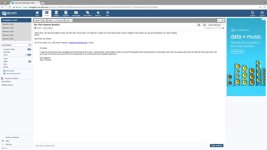
The theme for my project was film festival, I chose this theme as it was very different because it was a live brief and also working with clients. The Ramsgate film festival is in its 3rd year and my project required me to create a new layout for the programme, colour scheme, typeface, and a brand-new logo for next year. The booklet needed to be done before the festival which started on the 13th to the 16th of June.
I have my own Pinterest account, so I was able to create a folder for layout design, logo design, film festival posters also Bauhaus and Swiss design to maintain my own graphic design style and interests for inspiration.
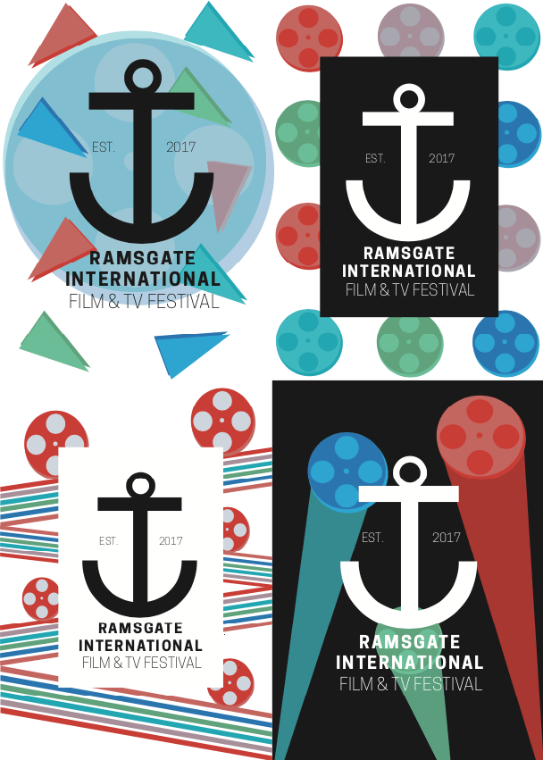
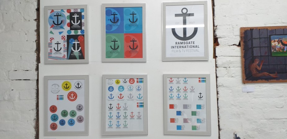
I researched graphic design trends from last year to this year to maintain today’s audience and past layout trends from the 80’s as that conveys a more geometric design which is more my style of work and also attract the older generation. For the logo design an anchor is the main feature and must be featured on the logo so I thought it made sense that I should research logos that features an anchor to see how other company’s and small businesses use these and how they incorporate it in their identity.
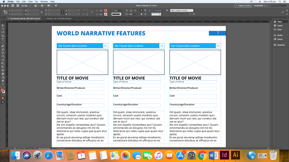
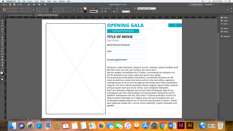
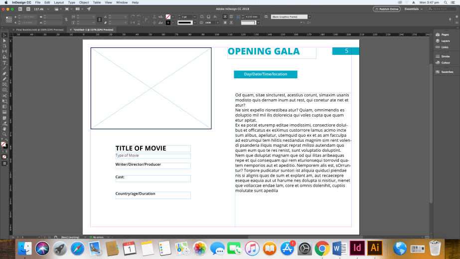
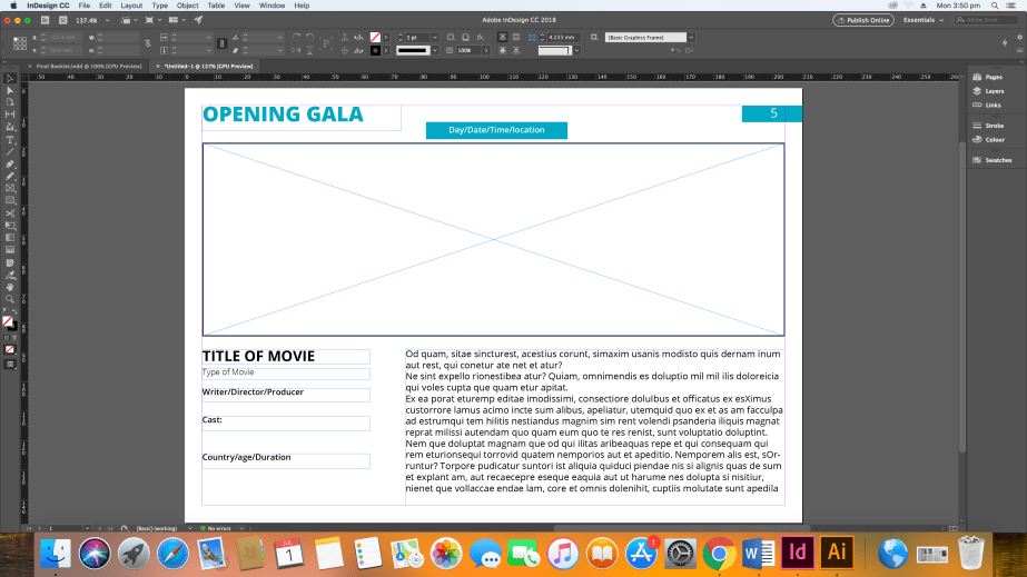
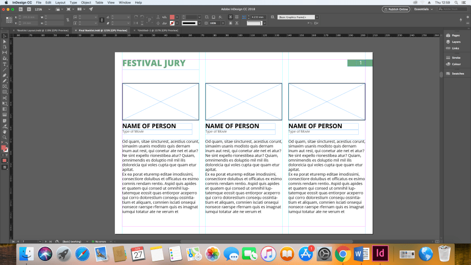
My understanding and research of text and image layout as helped improve my stages of development when making the booklet and the new logo, hierarchy was very important because I had to apply important information in the right order of important like for example: Day, date, time, location, writer, director, producer, cast, and country of origin, age and length of film. To an addition using grids to help place text and image was an important skill which developed and improved while experimenting.
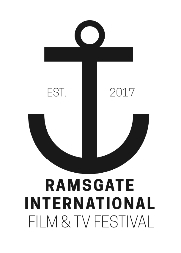
I mainly used shapes to create and experiment with my logo design which were mainly rectangles to form the anchor, I had a problem trying to create the arch bend for the bottom of the anchor as I was trying combine shapes to create that specific shape but I found it was too time consuming so I researched on how to create an arch on adobe illustrator which I was able to accomplish which was successful. It also helps balance the logo as it creates summitry and is even in terms of measurement.
I mainly used line, shape, colour and space. Shape is used in the booklet design to convey of where roughly text and image will be placed in the programme and blocks are used which contains information; the blocks act has a highlighter to convey hierarchy of text.
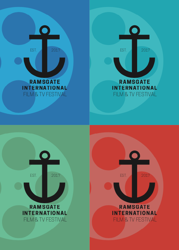
Furthermore, the logo is made by using the shape tool to make the rectangles, the arch and the circles for the tip of the logo. Line is used to help me divide columns when creating a layout for the film list so it does not look squashed and unattractive to read. Colour is used for the colour scheme which was used in the programme and in the development of the logo, applying the different colours to the anchor to see how appealing it would look and conveying a different tone. The spacing was used to make sure the text and images were evenly apart from each other in the structure with the help of grids as guides to keep everything consistent.
I think the colours play a big part as that brings the personally and tone out when it comes to branding, the colour scheme is very colourful which would attract my target audience dinner and show as they typically like attending events like theatre, concerts and other events that are linked with the arts. The colours would be engaging with the audience as they convey fun and entertaining and for this target audience they likely to respond to offers that position the arts in the same adjectives.
The message I was trying to convey was to show and tell the target audience that the Ramsgate film festival is a fun, relaxing and sociable event which is shown in the colours I have chosen.
I am very happy with my final piece most importantly the client was very happy with the booklet, it was my first time that I had to work with a client during a big live brief so considering that it went really successful. I have learnt a lot during the process especially time keeping because even though I had plenty of time to do the work for my FMP my client did not have the same equal time as I did so I had to adjust to her deadline which gave me less time to do the layout for the programme. Furthermore, I am very happy with the finished logo It looks fresh, clean and more modernised, the anchor changed during development in terms of the colour and size but it looks friendlier and relaxed which would match the colour scheme tone. The fact that the logo is black and white (depending on colour background) makes the logo more flexible for when it comes to advertising for the next festival as black can be applied to any colour background and can be seen easily from the human eye.
The things I would change is the Ramsgate map for the booklet originally, I was going make the map myself and to try and simplify but time was short so I didn’t have the time, so I screen shot a map from google maps of the area and labelled the important locations with numbers. So, If I was to do this again I would make my own map. To an addition the old logo for the film festival featured a film reel which went around the anchor, for the new logo it does not feature this, personally I thought the film reel would make the logo busier. However, the bronze award trophies that are used for the festival have use the same design as the old logo which makes a good link between the two so if I had to change something about the logo it would be to feature the film reel to include that connection.
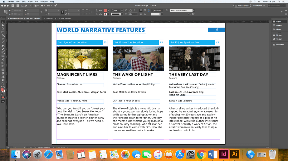
I started to include the films to see how they look when showcased, I’m really happy with the finished layout because it doesn’t look busy, just conveying lots of information in a simple form.
4)
3)
2)
1)
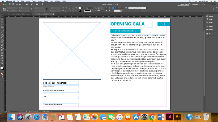
I created for experimental layouts with the opening gala page, I asked my peers to vote which one was more appropriate and most of the class liked the second layout because
IMAGES, HEADER & PRICE POSITIONING
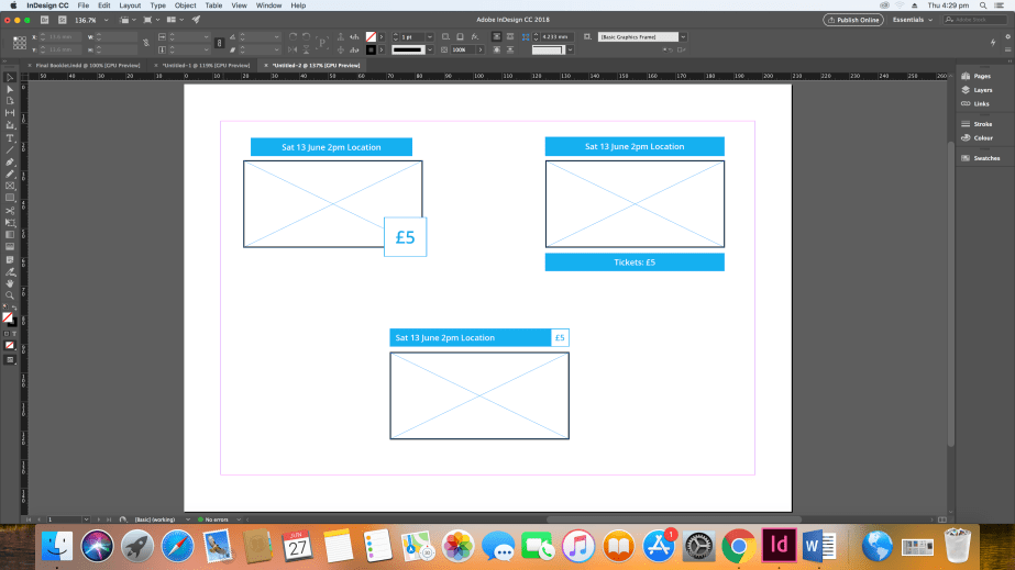
BOOK TAB

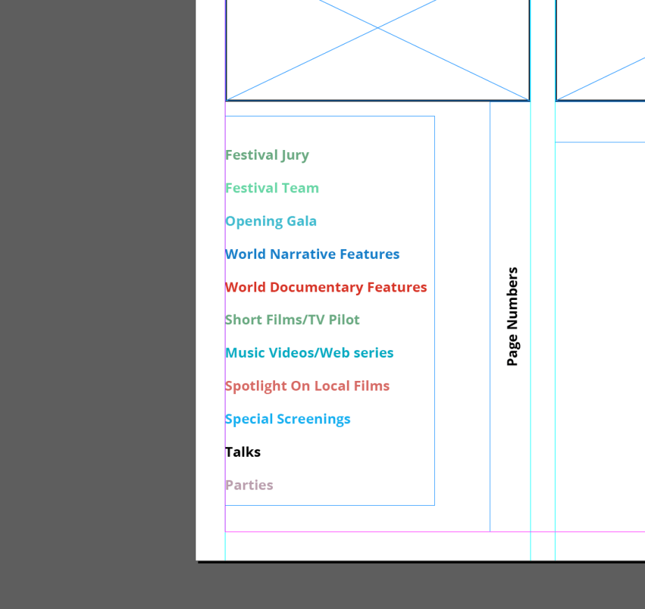
Having the markers as the same colour as the headers would convey a navigation, For example If the reader wanted to read a specific page they search for the colour in the content and find the colour tab that matches it.

During development
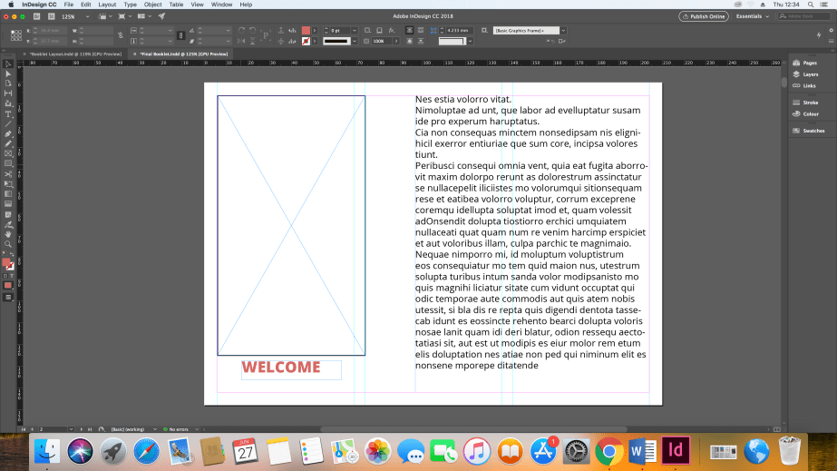
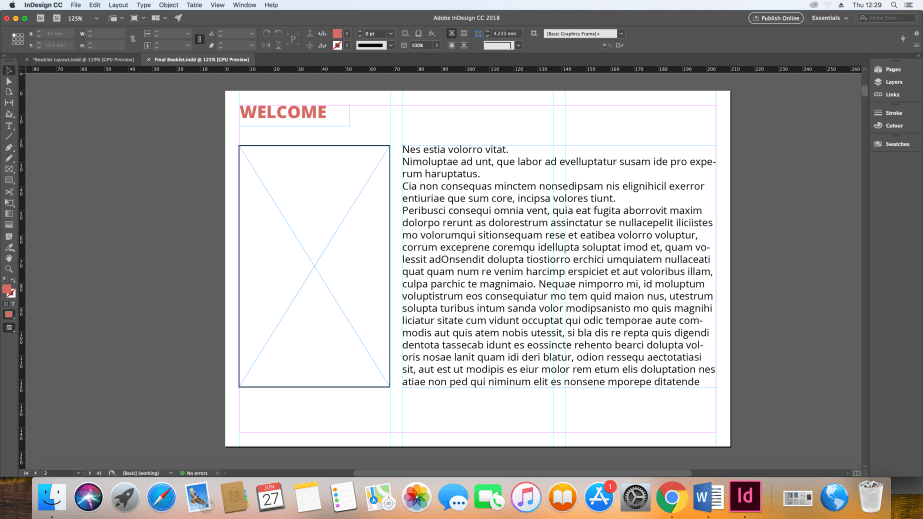
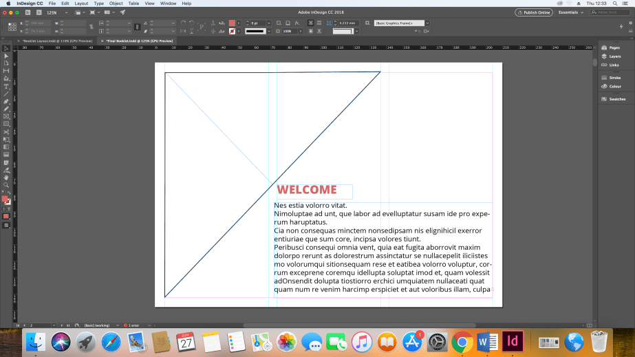
The development of the welcome page wasn’t as difficult as the others as this page had less information on it, I tried three different designs that I preferred out of my sketchbook. even though I like the geometric design aspect it didn’t look appropriate for the mood and tone that I wanted to convey. The Middle image is the design I will use for my final booklet I believe it conveys a simple and fresh design and similar to the last previous programmes and makes sence that the ‘welcome’ header is placed at the top as it feels like an introduction.
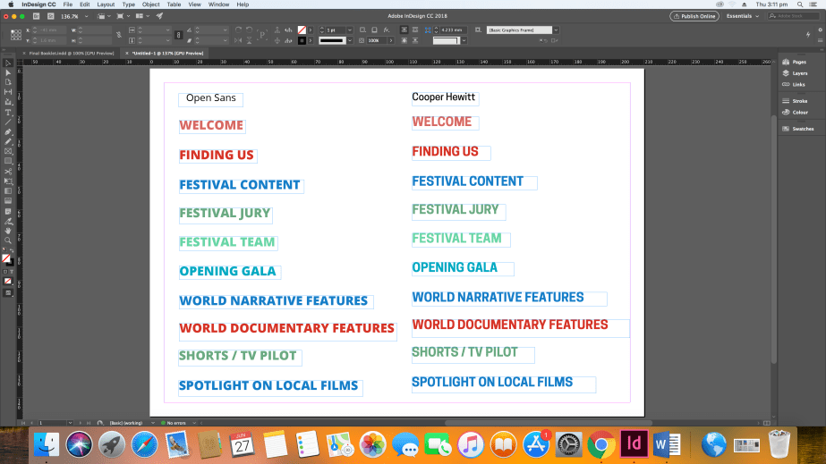
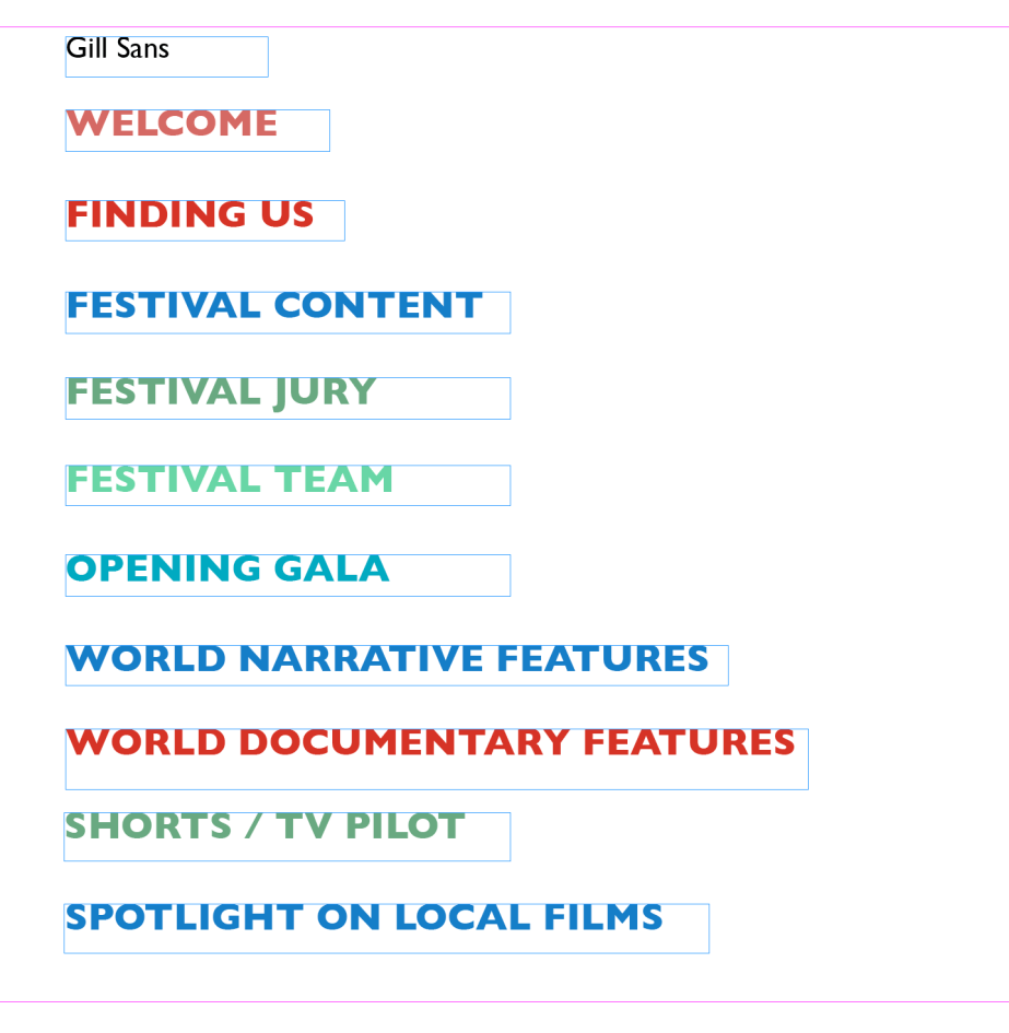
For the Typefaces that I have chosen: Open Sans, Cooper Hewitt and Gill Sans, I have chosen these typefaces as they look more fresh and modern and easy to read which is important when conveying information. Furthermore they all come in lots of different weights which is helpful when conveying hierarchy of text. However the typeface I believe is more appropriate is Open Sans because it feels and looks more friendly than the others, even though Cooper Hewitt was close I felt it was a bit too thin and tall to be a body text.
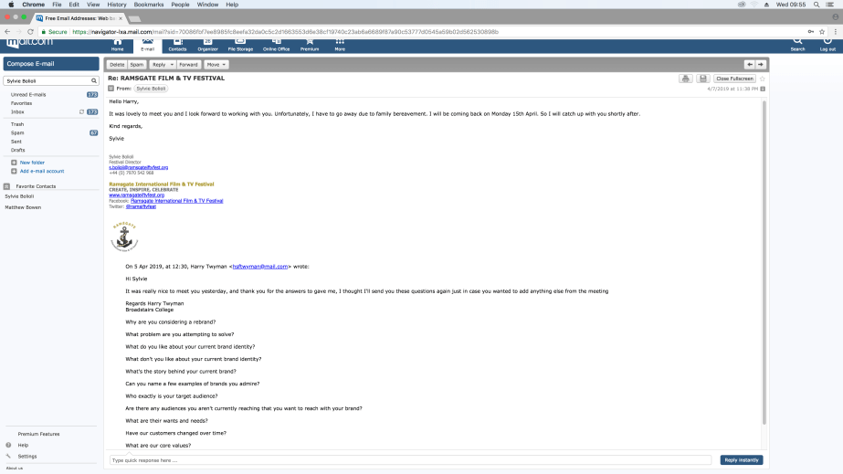
Thursday, April 4th 2019 (First Meeting with Sylvie Bolioli)
The meeting went really well, She gave me the last previous programmes to give me for inspiration and an idea of how the structure is used. She wanted a different colour scheme for this and a brand new logo for the re-branding of the film festival for next year and other additional pages needed for the programme.
Monday, 29th April 2019 (Second Meeting with Sylvie Bolioli)
I met up with Sylvie for an update on the programme. She was very happy with the layout and colour scheme, the only change she wanted was to not use the film images for the shorts, This to create more room for information and to have 6 films on one page. She explained that the reason for this was to keep printing prices down. She also e-mailed me the cover that won the competition and will be used for the cover for the programme.