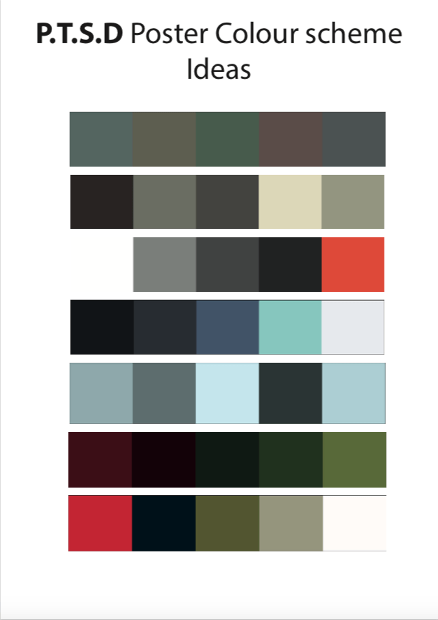
These images match the mood and tone that I want to convey when developing my poster ideas, the colours are not bright which is good because the message is a serious subject and to be taken seriously if bright colours were included, the message would not be or potentially be inconsistent.
The final outcome of my opening sequence ‘Strangetown’ was successful, the theme really suits the pace of the sequence and the timing collaboration between the keyframes and the text fading in and out. This creates a haunting tone and the tension builds as the theme progresses to unveil the title of the series. The outline of the rooftops builds as the sequence progresses working well with the theme and the eclipse moon giving it a more scarier tone.
Red moon from Harry Twyman on Vimeo.
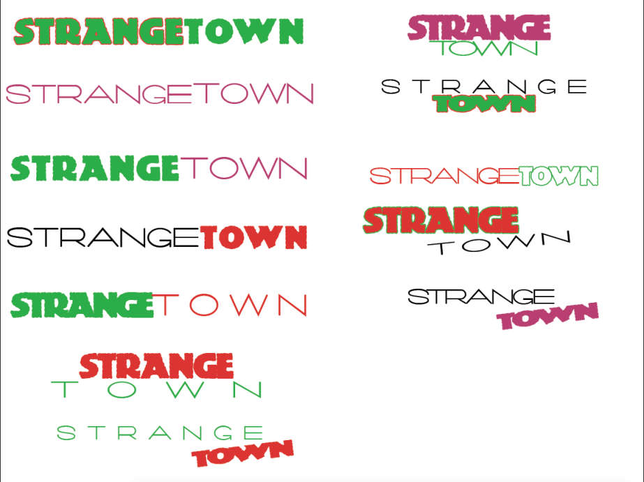
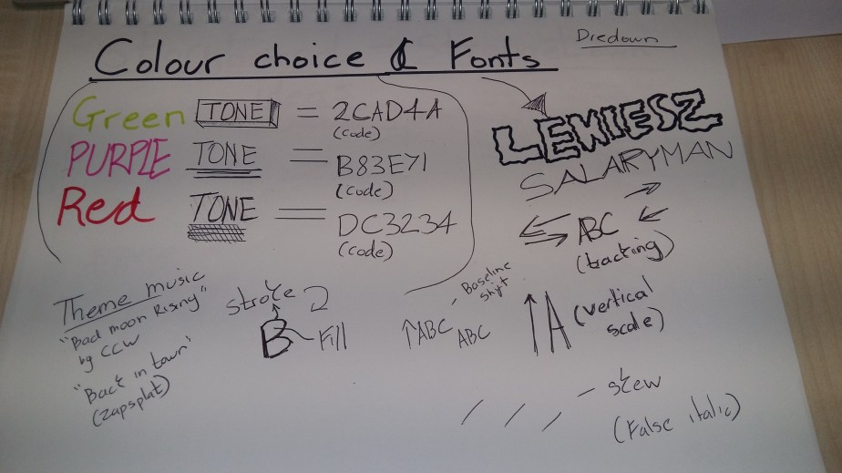
My chosen colour swatch and fonts
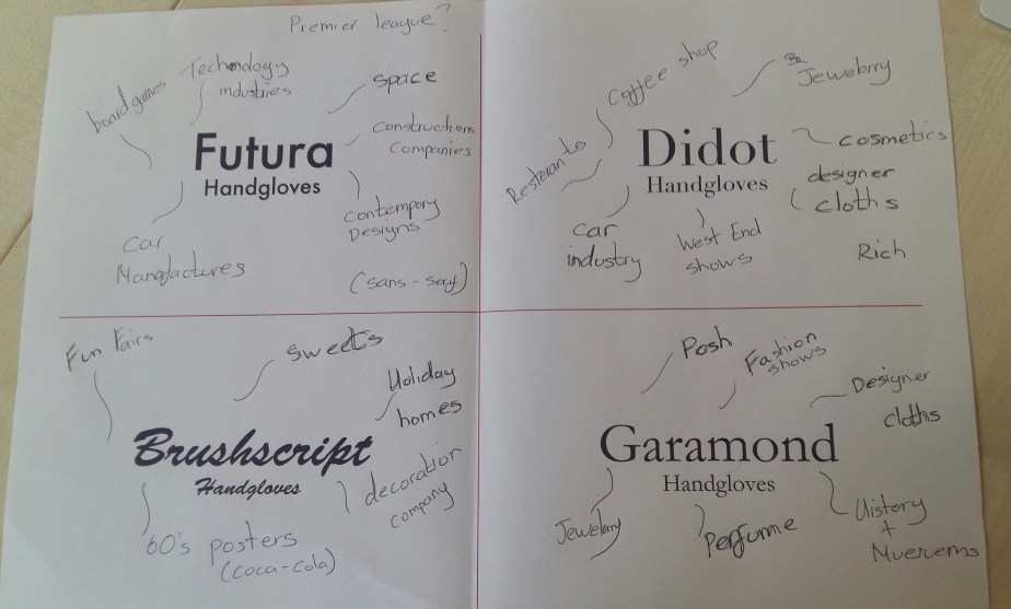
COLOUR COLLABORATION
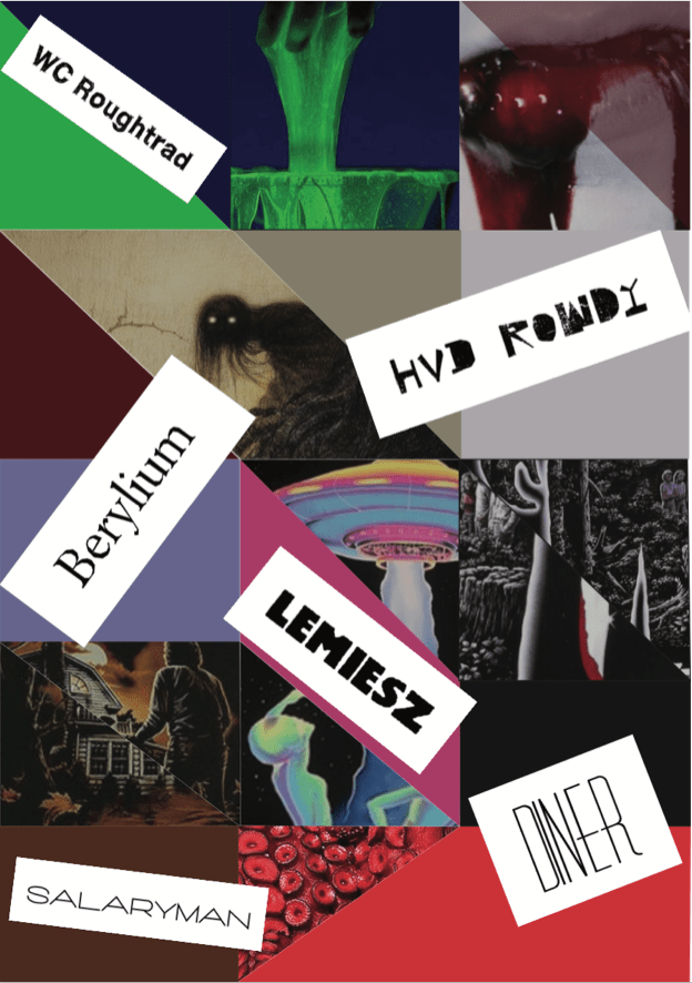
FONT COLLABORATION
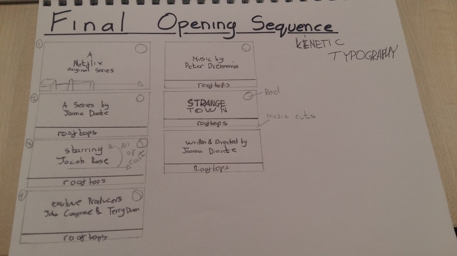
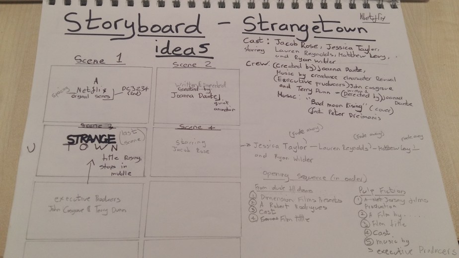
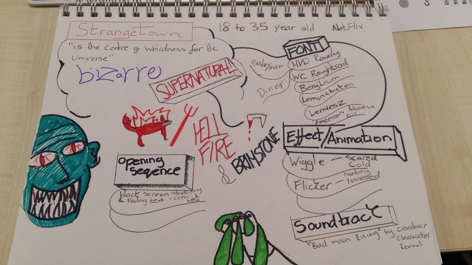
MY MOODBOARD FOR MY STRANGETOWN OPENING SEQUENCE
The typefaces displayed on the moodboard all convey mystery and horror but the typeface ‘LEMIESZ’ fits more into the genre supernatural, its big and bold which helps it stand out and the outline of the letters are very bumpy which gives it that slime texture which will increase the tone on the strangetown opening sequence.
The original ‘Bad Moon Rising’ by Creedence Clearwater Revival (1969) would have been a suitable theme for the genre supernatural, but it was too relatable to the film ‘An American werewolf in London'(1981) which the song is featured.
so this cover version is very different in terms of pace and mood also conveys a haunting and mysteries tone.
ALIEN (1979)
The text is constructed as the sequence progresses which creates tension and collaborates with the atmospheric audio which creates a haunting tone.
It also conveys mystery because the visuals only show stars and a planet and are shown in dark tones which would indicate that its a bad place.
PULP FICTION (1994)
FROM DUSK TILL DAWN (1996)
The opening sequence is very engaging and the music conveys grittiness and goes well with the font ‘Dharma slab expanded heavy’ which is a an effective collaboration. This makes the tone of the film more visible
STRANGER THINGS (2016 – PRESENT)
This font is called ‘American Advertise 011’ it looks very haunting which will match the tone of my opening sequence of ‘Strangetown, the slow pace of the kinetic typography conveys a spooky and dark tone