Final Posters & Evaluation

This slideshow requires JavaScript.

I am really satisfied about my final posters, they all convey a deep, impactful message about P.T.S.D and how the target audience would be impacted by them by their haunting yet eye catching design. If these posters were be printed and displayed, they would be A3 showcased near a hospital or in a hospital, at a bus stops as a bus is a common way people get from A to B, also train stations.

The posters are for the Mental Health Foundation, which is a British charitable organisation that provides information, carries out research, and campaigns to improve services for people affected by mental health problems.

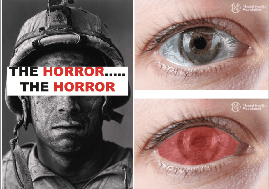
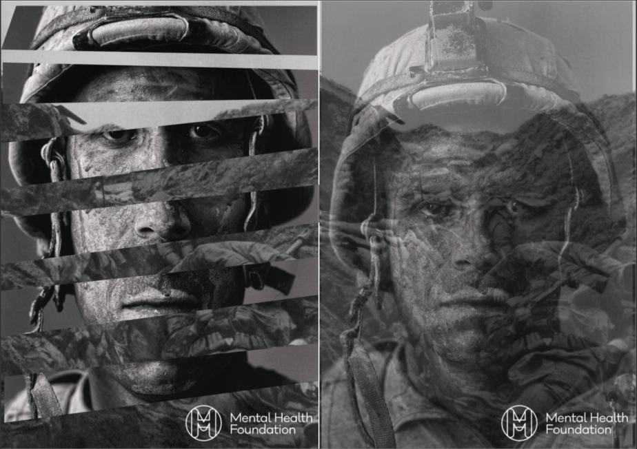
SOLDIER FINAL POSTERS

The first soldier poster features words associated with P.T.S.D floating in the head area conveying a mind battle between the symptoms and the general mind. The words are red which will indicate a warning or danger of the words and the head being white symbolising hope. The is featured as really like the juxtaposition between the serious mood and tone of the poster and the smile which conveys happiness and peace of mind.

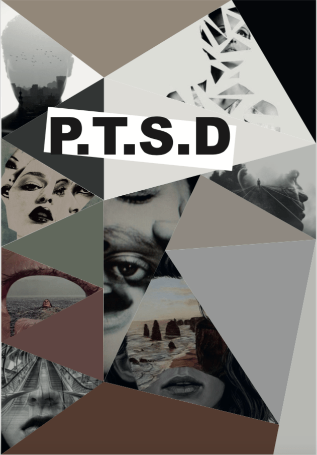
The second poster uses fragmented shapes to conveys isolation and poor state of mind, the background is black because it symbolises fear, mystery and death which the soldier is being haunted by.
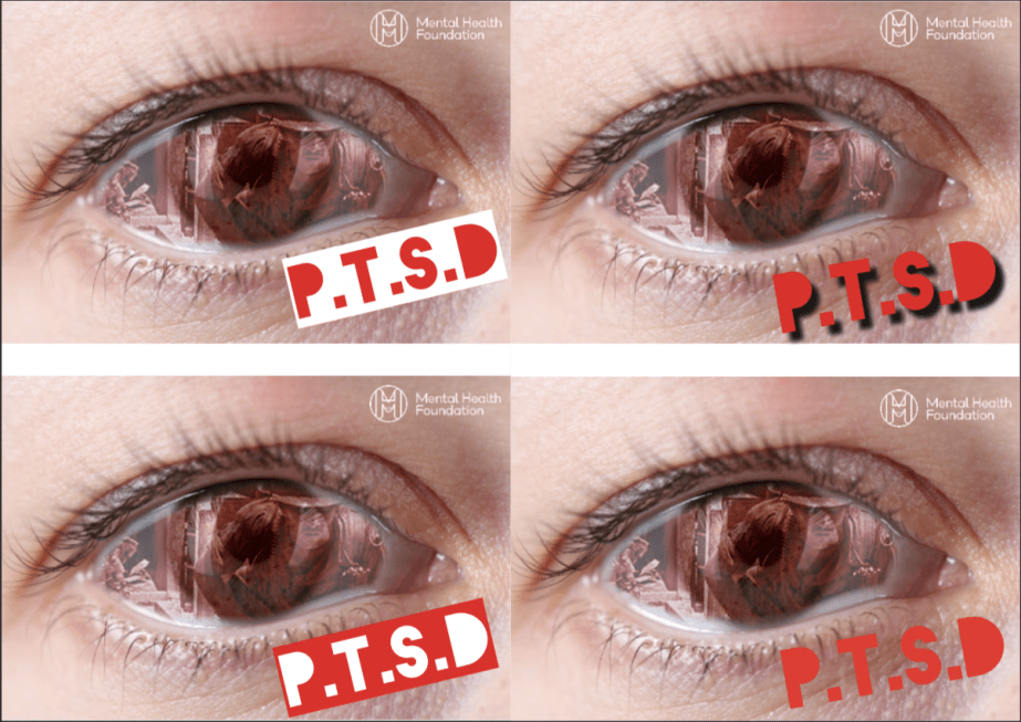
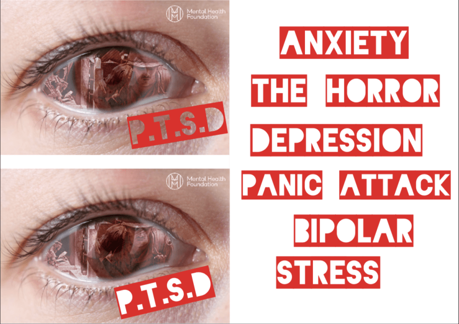
EYE FINAL POSTERS

These posters were a success because the message is impactful showing imagery of conflict in the eye which creates the focal point of the poster and the blood red increases the engagement and dark tone. I chose different skin colours on both posters to avoid isolation towards any ethnic as anybody can have a mental illness.

WHAT WOULD YOU IMPROVE?

I would take my own images of an eye to experiment with different perspectives to make my posters look more different and interesting and use different people from different religions and backgrounds so even though the target audience is for people that knows someone or family member that has the condition, but also opens to a broad audience at the same time.

Eye & Face Experimentation


Screen Shot 2018-11-15 at 10.05.49

I asked my colleagues to choose which design was their favourite and what worked well with the typeface. Most of them picked the bottom left design because “The white against the red background makes the poster more engaging and would lead the target audiences eyes to the focal point; the red eye.


Screen Shot 2018-11-15 at 10.05.38

The chosen typeface is called ‘Blackout’ which is an ironic name for the subject matter. The colour choice was bright red as its an engaging colour which symbolizes warning, danger, blood, war and power. The words that I chose relate to P.T.S.D like the side effects  and mental illnesses during the P.T.S.D process.


Screen Shot 2018-11-15 at 10.05.28

I experimented with text to see if it increased the dramatic effect to the posters, was relectant to include text as sometimes imagery speaks louder than words. The quote from the 1979 Vietnam film ‘Apocalypse Now’ “The Horror….The Horror” was included to convey a more sinister approach and referencing a cult film dealing with the same subject matter.


Screen Shot 2018-11-15 at 10.05.20

These poster designs convey a more haunting yet eye catching effect due to the distorted imagery The fragmented poster (Left) to influenced by my other fragmented designs, instead an image is placed behind the shapes revealing dead soldiers in trenches. The other poster (Right) users low opacity to reveal the same image making the poster more disturbing.


Screen Shot 2018-11-15 at 10.05.08

These experimentations visualise the mind and conveys strong events during conflict and what they see in the head everyday. The first experiment (Left) creates a haunting feel as the imagery covers the veterans eyes symbolizing power and mastery over the veteran like a disease. The second experiment (Right) is the same but features a smile, this was included as I wanted to create a juxtaposition between a serious message and a misleading visual giving it more attention and gives the target audience something to think about.


Screen Shot 2018-11-15 at 10.04.51

These experimentations are really effective as the fragmented shapes convey isolation, unforgotten and depression. The black and white increases the mood of the poster as it hits the target audience (people who know or a family member suffering from P.T.S.D) stronger including the sad facial expression from the veteran placed in the shapes. Which in a way makes the poster more sinister to look at. This also conveys that they’re mind is lost and is spiralling out of control.


This slideshow requires JavaScript.

This slideshow requires JavaScript.

These are rough ideas of how to convey my message across to the target audience by using impacting imagery and dark tones of colour. This will increase its attention and message and hopefully raise eyebrows to the target audience.

Invisible Wounds – Break Down Documentary (50min)


20181031_094716

This documentary explores P.T.S.D (Post Traumatic Stress Disorder) the symptoms and difficulties veterans suffer after conflict and returning and adapting to a normal life again.


MY PROJECT, INTENTIONS & TARGET AUDIENCE

My project will be about veterans suffering from P.T.S.D (Post Truamatic Stress Disorder) and raising awareness of the condition. I will make posters which will be impacting and dark in tone to increase it’s message and more engaging. The Target audience will be people who know someone or family member that is suffering from this mental illness.


This slideshow requires JavaScript.


Bibliography

Carson, N. and Hamilton, R. (2018). 21 perfect font pairings. [online] Creative Bloq. Available at: https://www.creativebloq.com/typography/20-perfect-type-pairings-3132120 [Accessed 2 Nov. 2018].

Color.adobe.com. (2018). Adobe Color CC. [online] Available at: https://color.adobe.com/explore/?q=Depression [Accessed 2 Nov. 2018].

Mental Health Foundation. (2018). Home | Mental Health Foundation. [online] Available at: https://www.mentalhealth.org.uk [Accessed 15 Nov. 2018].

FINISHED TYPEFACE OPTIMA POSTER

Screen Shot 2018-10-05 at 15.56.26


STRANGETOWN FINAL OPENING SEQENCE

StrangeTown from Harry Twyman on Vimeo.

The final outcome of my opening sequence ‘Strangetown’ was successful, the theme really suits the pace of the sequence and the timing collaboration between the keyframes and the text fading in and out. This creates a haunting tone and the tension builds as the theme progresses to unveil the title of the series. The outline of the rooftops builds as the sequence progresses working well with the theme and the eclipse moon giving it a more scarier tone.

StrangeTown Opening Sequence Development & Final Piece

StrangeTown from Harry Twyman on Vimeo.

The final outcome of my opening sequence ‘Strangetown’ was successful, the theme really suits the pace of the sequence and the timing collaboration between the keyframes and the text fading in and out. This creates a haunting tone and the tension builds as the theme progresses to unveil the title of the series. The outline of the rooftops builds as the sequence progresses working well with the theme and the eclipse moon giving it a more scarier tone.

20180928_124804

20180928_124756

Red moon from Harry Twyman on Vimeo.

My chosen colour swatch and fonts
Screen Shot 2018-09-28 at 13.04.05

COLOUR COLLABORATION
Screen Shot 2018-09-20 at 11.15.10

FONT COLLABORATION
Screen Shot 2018-09-20 at 09.16.05

20180921_113000

MY MOODBOARD FOR MY STRANGETOWN OPENING SEQUENCE

Screen Shot 2018-09-14 at 15.38.30

The typefaces displayed on the moodboard all convey mystery and horror but the typeface ‘LEMIESZ’ fits more into the genre supernatural, its big and bold which helps it stand out and the outline of the letters are very bumpy which gives it that slime texture which will increase the tone on the strangetown opening sequence.

The original ‘Bad Moon Rising’ by Creedence Clearwater Revival (1969) would have been a suitable theme for the genre supernatural, but it was too relatable to the film ‘An American werewolf in London'(1981) which the song is featured.
so this cover version is very different in terms of pace and mood also conveys a haunting and mysteries tone.

ALIEN (1979)

The text is constructed as the sequence progresses which creates tension and collaborates with the atmospheric audio which creates a haunting tone.
It also conveys mystery because the visuals only show stars and a planet and are shown in dark tones which would indicate that its a bad place.

PULP FICTION (1994)

FROM DUSK TILL DAWN (1996)

The opening sequence is very engaging and the music conveys grittiness and goes well with the font ‘Dharma slab expanded heavy’ which is a an effective collaboration. This makes the tone of the film more visible

STRANGER THINGS (2016 – PRESENT)

This font is called ‘American Advertise 011’ it looks very haunting which will match the tone of my opening sequence of ‘Strangetown, the slow pace of the kinetic typography conveys a spooky and dark tone

20180921_112919