Author: harrysblog97
I am studying Creative Media level 3 year 2, before this I studied Art & Design for 3 years. I also like listening to music such as rock, techno, Synthpop and new wave. And a massive fan of AC/DC.
IT MAGAZINE
EVIL GIRL – FINAL PIECE
final edit (Converted) from Harry Twyman on Vimeo.
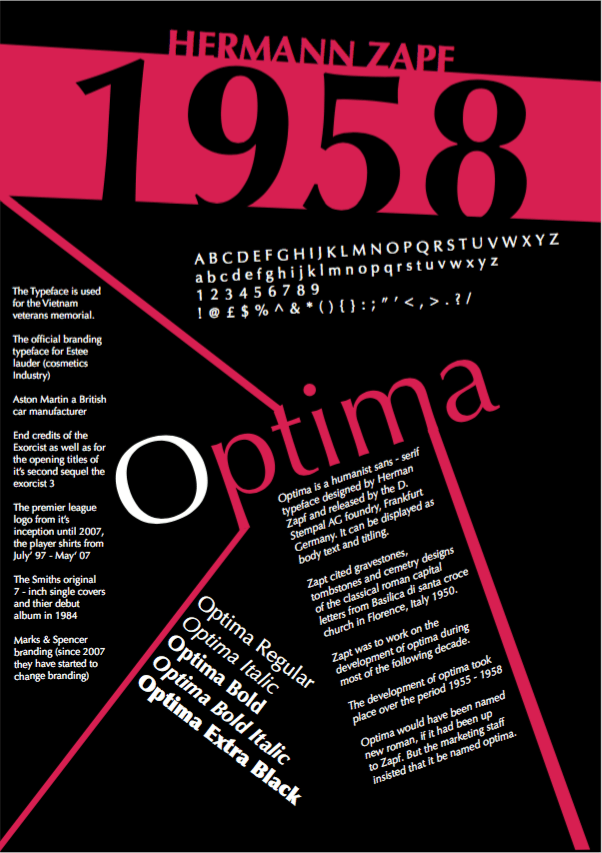
FINISHED TYPEFACE OPTIMA POSTER
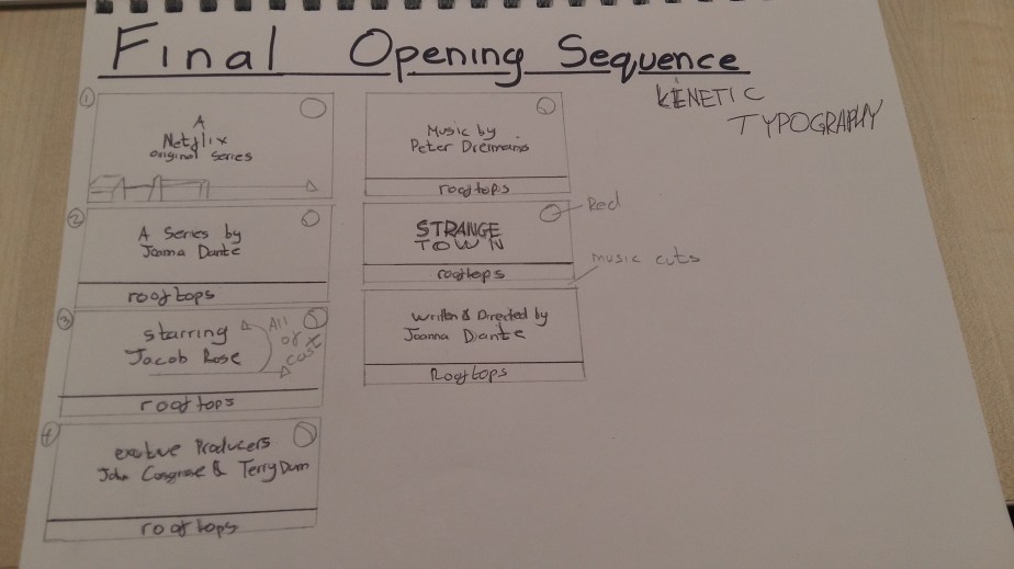
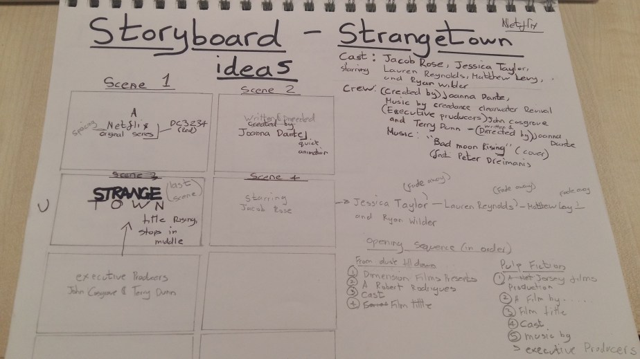
STRANGETOWN FINAL OPENING SEQENCE
StrangeTown from Harry Twyman on Vimeo.
The final outcome of my opening sequence ‘Strangetown’ was successful, the theme really suits the pace of the sequence and the timing collaboration between the keyframes and the text fading in and out. This creates a haunting tone and the tension builds as the theme progresses to unveil the title of the series. The outline of the rooftops builds as the sequence progresses working well with the theme and the eclipse moon giving it a more scarier tone.
PHOTOGRAPHY EXPERIMENTATION (GOOD POINTS & BAD POINTS)
IMAGE 3
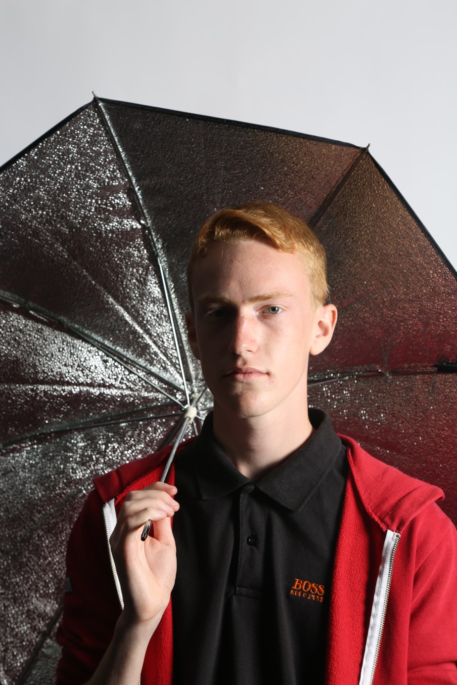
IMAGE 2
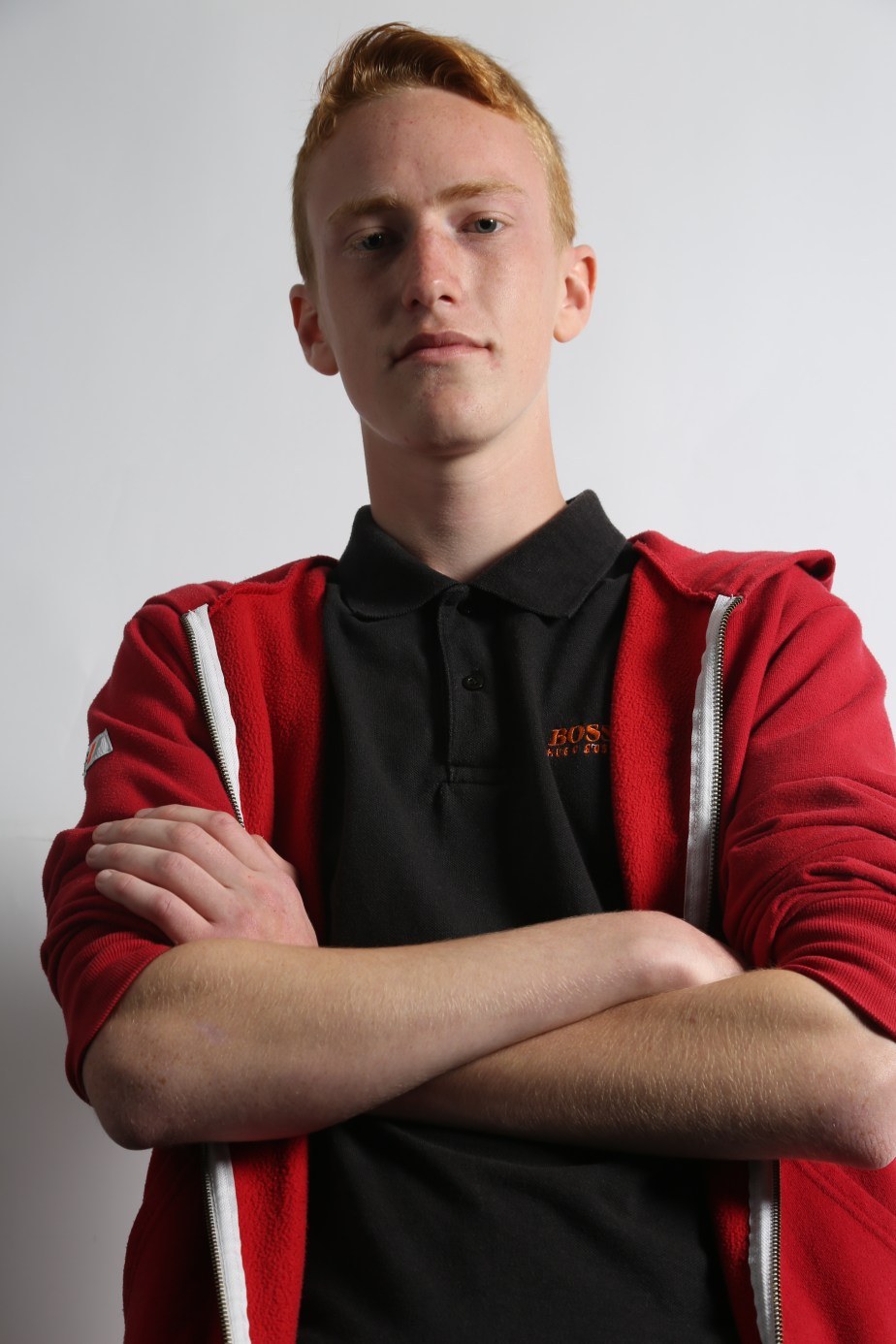
The exposure is really good it makes the red jacket more vibrant and makes the image more eye catching, it’s in focus which is important. The elbow of the right arm has been cut off, cutting off limbs from a model is a big no no unless your taking a body shot avoiding the legs which is common in photography to advertise shirts, jumpers, etc in magazines. To improve this the model have to move more central to avoid any limb cutting.
IMAGE 1
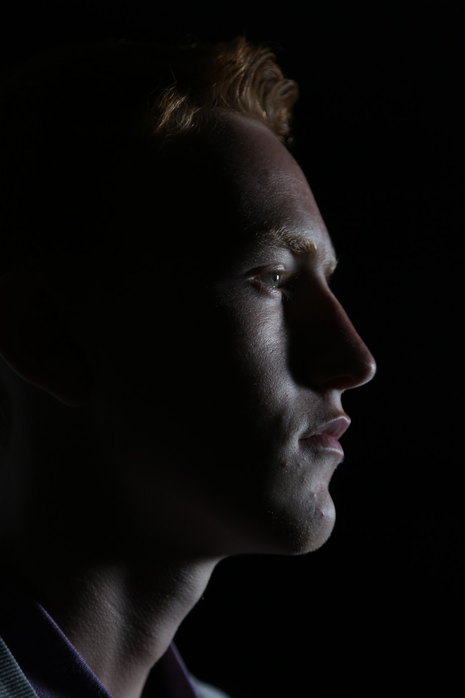
The image has very a good focus which makes the textures from the skin more visible, but the hair line to the actual hair is out of focus as the focusing was only concentrating of the face area then as a whole. to improve this make sure everything is in focus before taking. The nose does not show much of a scale as the shadows mute it, to improve this a reflector would be used to bounce the key light to the shadowed area of the face to display more shape of the model.
The colour tone is very cold which is effective if your using this image to showcase a space or sc-fi theme as it would make sense as space is a cold and dark atmosphere.
If this was to be improved colour wise colour filters would an alternative to give more life to the model and the image in general or edit it in photoshop.
Overall I like the image its probably my best one in a long time considering I haven’t been taught photography consistently and this is a big step forward improving my skills.
Optima Typeface Design


StrangeTown Opening Sequence Development & Final Piece
StrangeTown from Harry Twyman on Vimeo.
The final outcome of my opening sequence ‘Strangetown’ was successful, the theme really suits the pace of the sequence and the timing collaboration between the keyframes and the text fading in and out. This creates a haunting tone and the tension builds as the theme progresses to unveil the title of the series. The outline of the rooftops builds as the sequence progresses working well with the theme and the eclipse moon giving it a more scarier tone.
Red moon from Harry Twyman on Vimeo.
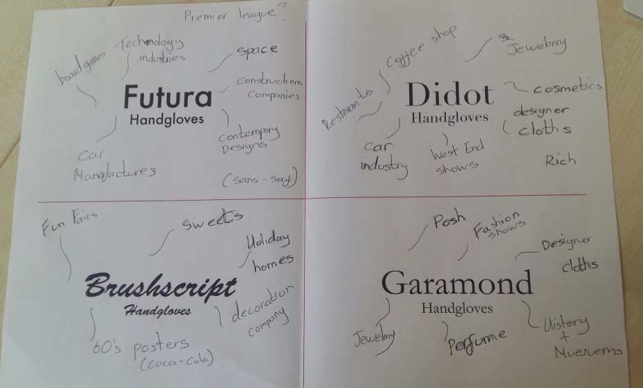
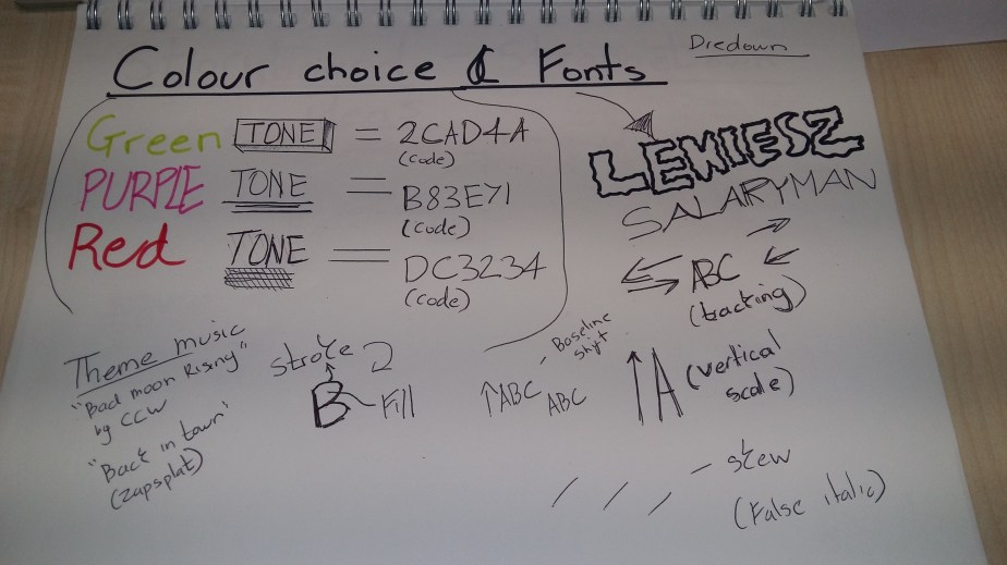
My chosen colour swatch and fonts
COLOUR COLLABORATION
FONT COLLABORATION

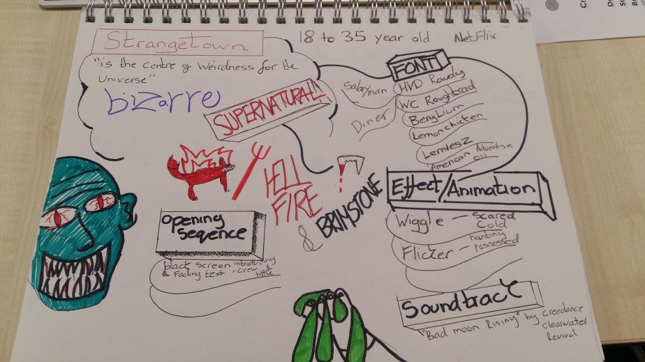
MY MOODBOARD FOR MY STRANGETOWN OPENING SEQUENCE
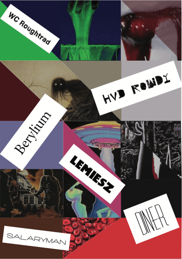
The typefaces displayed on the moodboard all convey mystery and horror but the typeface ‘LEMIESZ’ fits more into the genre supernatural, its big and bold which helps it stand out and the outline of the letters are very bumpy which gives it that slime texture which will increase the tone on the strangetown opening sequence.
The original ‘Bad Moon Rising’ by Creedence Clearwater Revival (1969) would have been a suitable theme for the genre supernatural, but it was too relatable to the film ‘An American werewolf in London'(1981) which the song is featured.
so this cover version is very different in terms of pace and mood also conveys a haunting and mysteries tone.
ALIEN (1979)
The text is constructed as the sequence progresses which creates tension and collaborates with the atmospheric audio which creates a haunting tone.
It also conveys mystery because the visuals only show stars and a planet and are shown in dark tones which would indicate that its a bad place.
PULP FICTION (1994)
FROM DUSK TILL DAWN (1996)
The opening sequence is very engaging and the music conveys grittiness and goes well with the font ‘Dharma slab expanded heavy’ which is a an effective collaboration. This makes the tone of the film more visible
STRANGER THINGS (2016 – PRESENT)
This font is called ‘American Advertise 011’ it looks very haunting which will match the tone of my opening sequence of ‘Strangetown, the slow pace of the kinetic typography conveys a spooky and dark tone
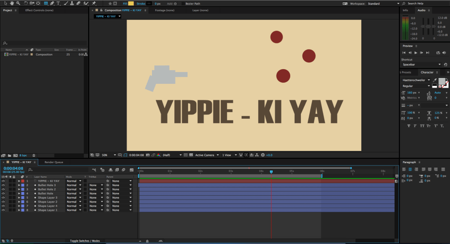
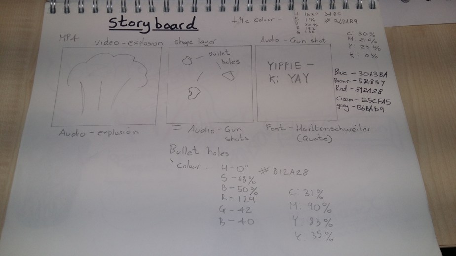
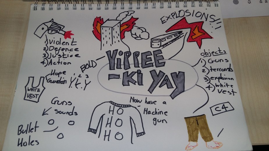
AFTER EFFECTS (YIPPIE – KI YAY)
YIPPIE – KI YAY (Adobe After Effects)
I’m really happy with the final result,after affects is very in depth and a pain in some cases as most of it is based on timing working with typography and shape.
The reloading of the gun creates the anticipation of the shots about to be fired, the opacity tool is used to make the bullet holes appear quickly by moving the keyframes closer together. everything went my way except when exporting the file it didn’t include the background colour it only displayed a black background.
However the black background did look very effective when collaborating with the blood red circles.
The original colour was to display cream skin colour to convey are person being shot at.
To improve this the gun fire audio would be included to make the clip more gritty and engaging and small footage of an explosion at the beginning to grab the attention of the audience.
The Font is called ‘Haettenschweiler’ its very gritty and bold which matches the tone of the clip and stands out.
Saul Bass was my inspiration the way he uses shapes to tease or summarise the plot and even though he uses a soundtrack for the opening sequences, you can still identify what tone and plot the film/TV series has if you mute the sound.
OPENING SEQUENCE RESEARCH
Chasing Lights In The Himalayas
Se7en (1995)
Shaun Of The Dead (2004)
