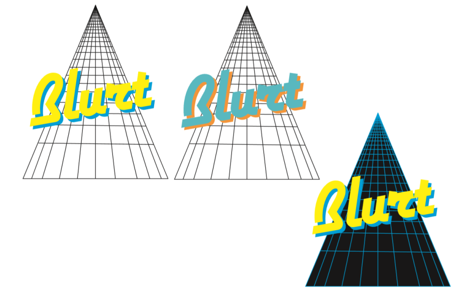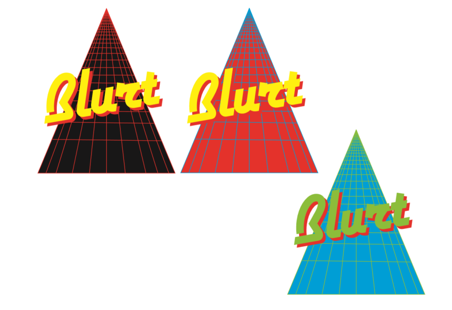
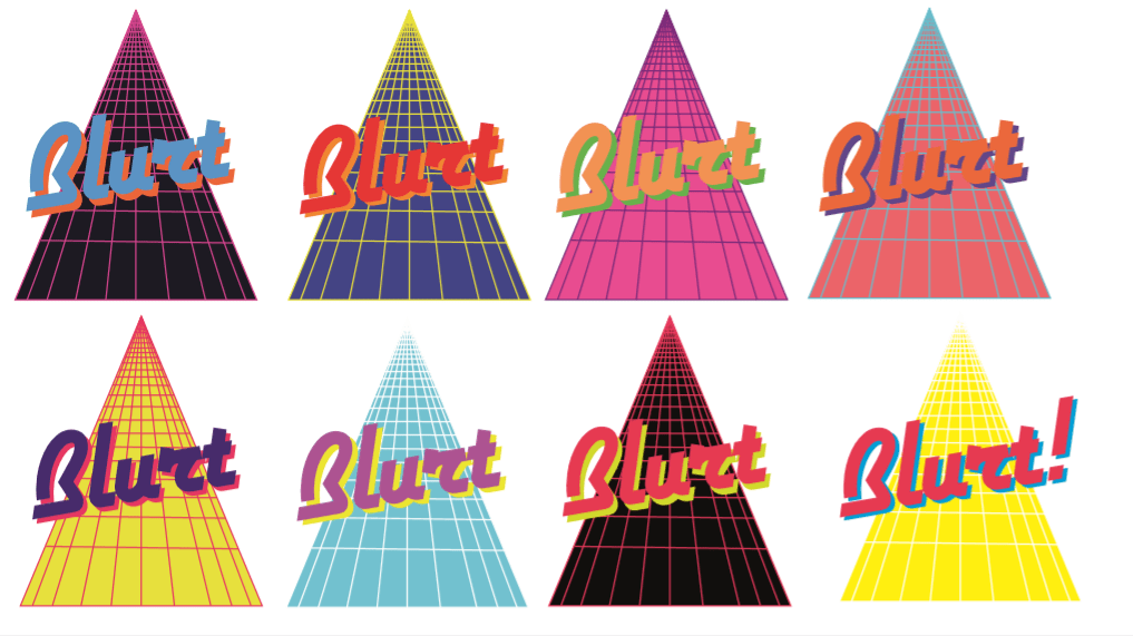
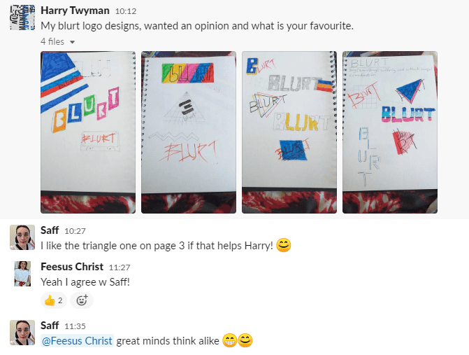
More experimentation with grid Blurt logo


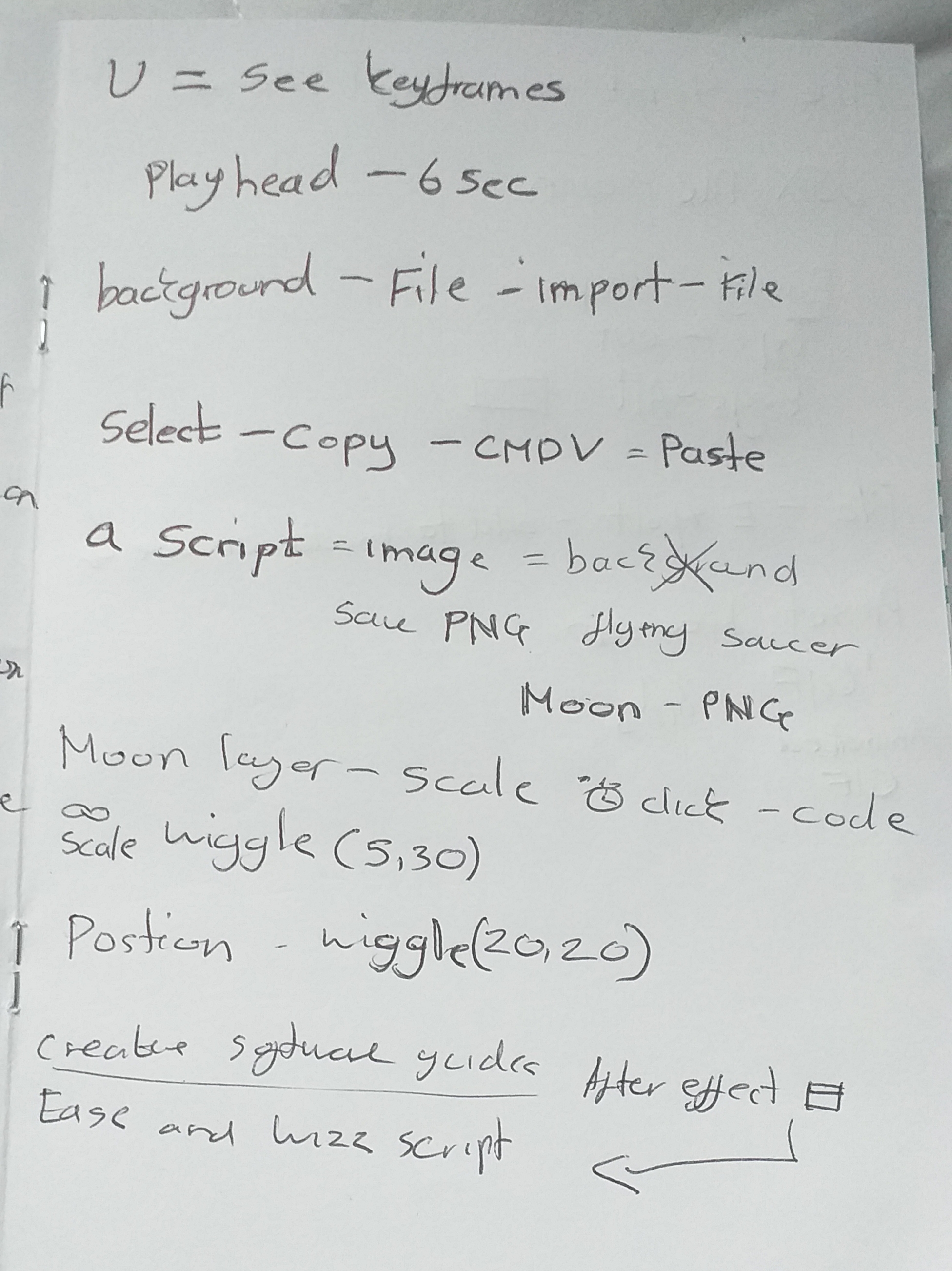
Really happy with my GIF experiments so far, the process was really easy as making a GIF is not as complex compared to making a title sequence for as example. it only requires one movement depending on what your after in terms of repetition or movement. There is a tool called the puppet tool which function like pins that hold down specific areas on objects to mute movement. The puppet tool can be placed anywhere on your chosen object to create movement
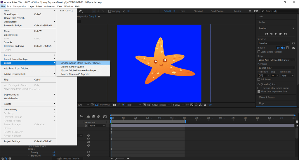
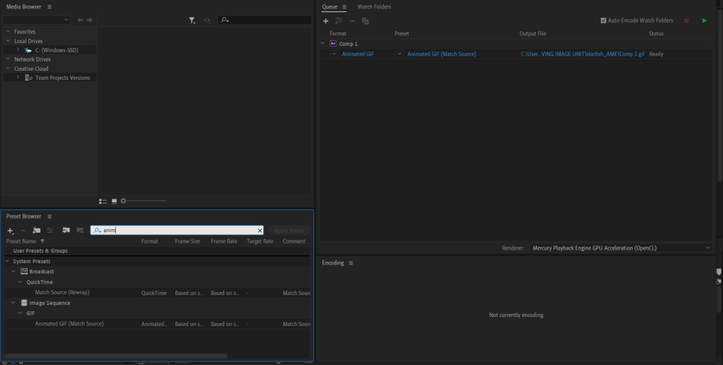
The key frames will determine the duration/speed of the animation. After the GIF is created you go to File – Export – Add to Adobe Media Encoder Queue.


Based on the feedback from family, friends and colleagues, a lot of people really liked the concept of my ideas in general of animation and logo design. I got good feedback from my opening sequence of Mad Max people have been saying its effective and the music choice was in sync with the motion graphics. I’m planning on making more of these as the transaction between shape and text really was consistent.
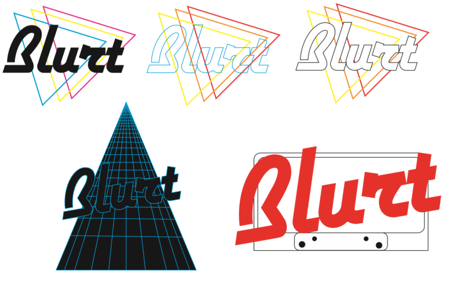
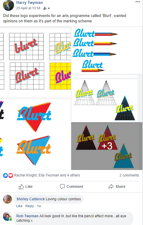
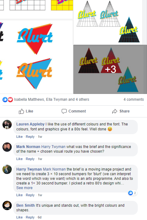
My Logo designs were very popular to a lot of people, they have been saying the concept and experiments are very retro and a reference to the 1980’s decade which was my intention and was satisfied my designs showcased that.
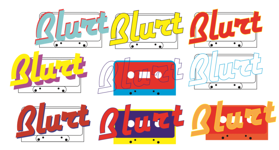
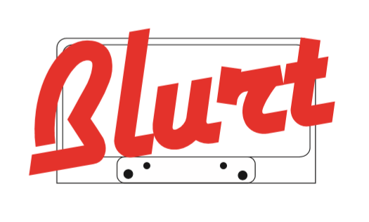
The most popular logo concept out of the feedback was a three way battle between: the Triangle grid concept, the cassette tape concept, and the trio triangle concept. (Visuals below)
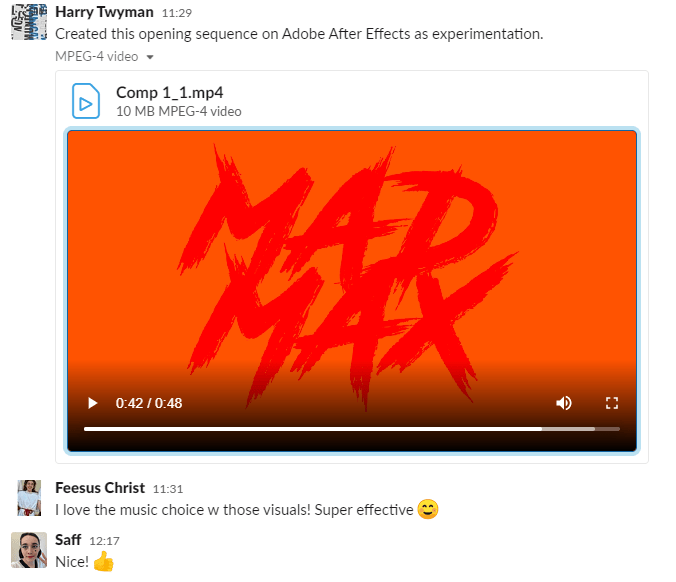
Comp 1_1 from Harry Twyman on Vimeo.
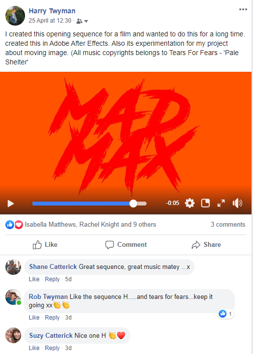
I have wanted to do this opening sequence for a while as Mad Max is one of my favourite movie franchises. I was inspired by Saul Bass and the simplicity of his opening sequences, I wanted to create a more retro feel to it as this will echo through out my design stages. During this process I increased the title ‘MAD MAX’ so the background becomes crimson red even though the set background colour is peachy orange. I wanted the main title to become smaller unveiling a letter form or an abstract canvas while the credits move with it. This made the sequence more dramatic and gave it mystique as the music contributed towards the mood and vibe.
The Typefaces I have used for this is ‘Road Rage’ and ‘Mistral’ to give the title sequence more of an nostalgic and retro feel.
To improve the title sequence I would create a clipping mask in the main title ‘MAD MAX’ to unveil a setting as the title becomes bigger to eventually it to disappear from the frame giving the setting the full canvas.