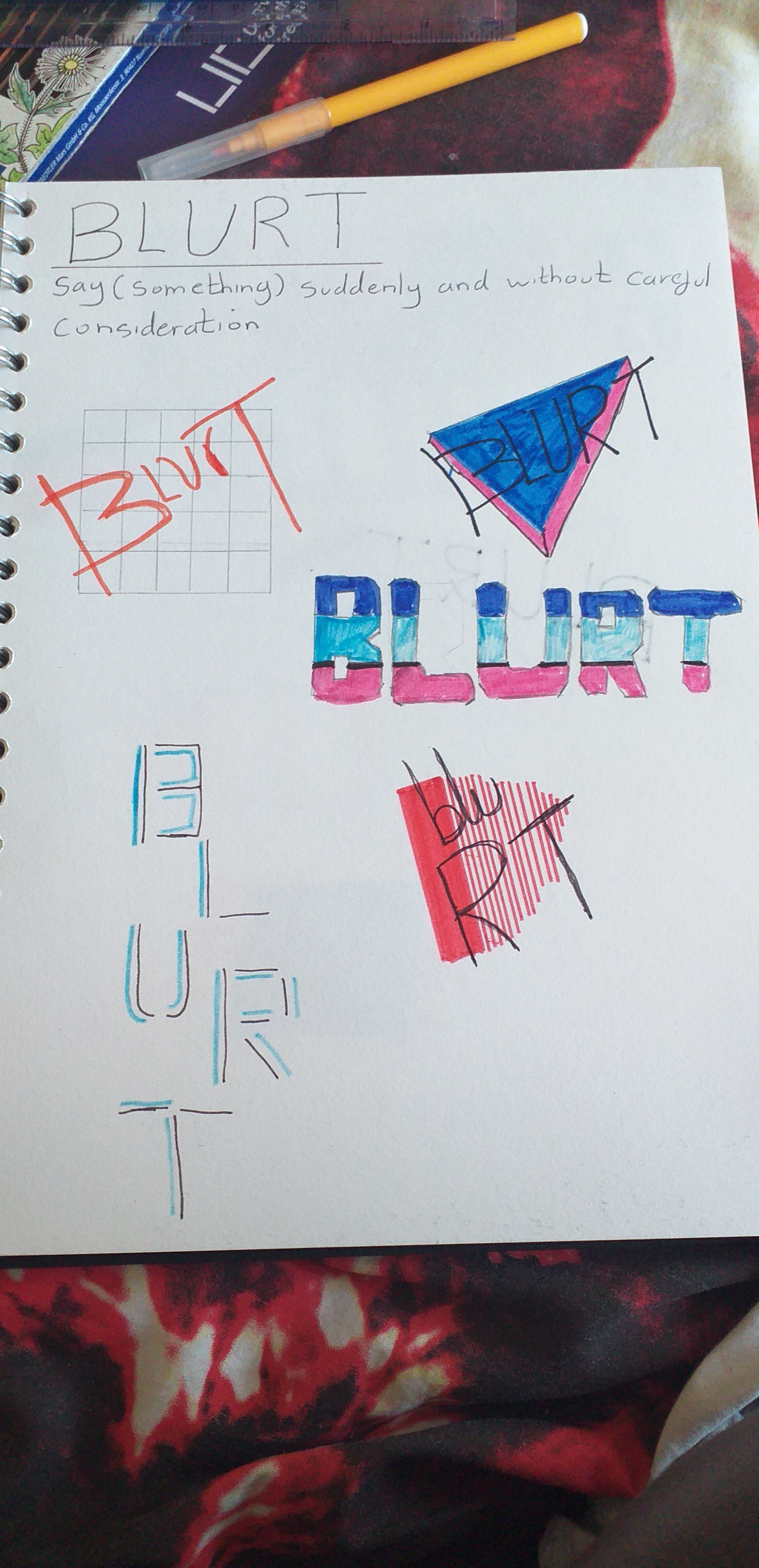
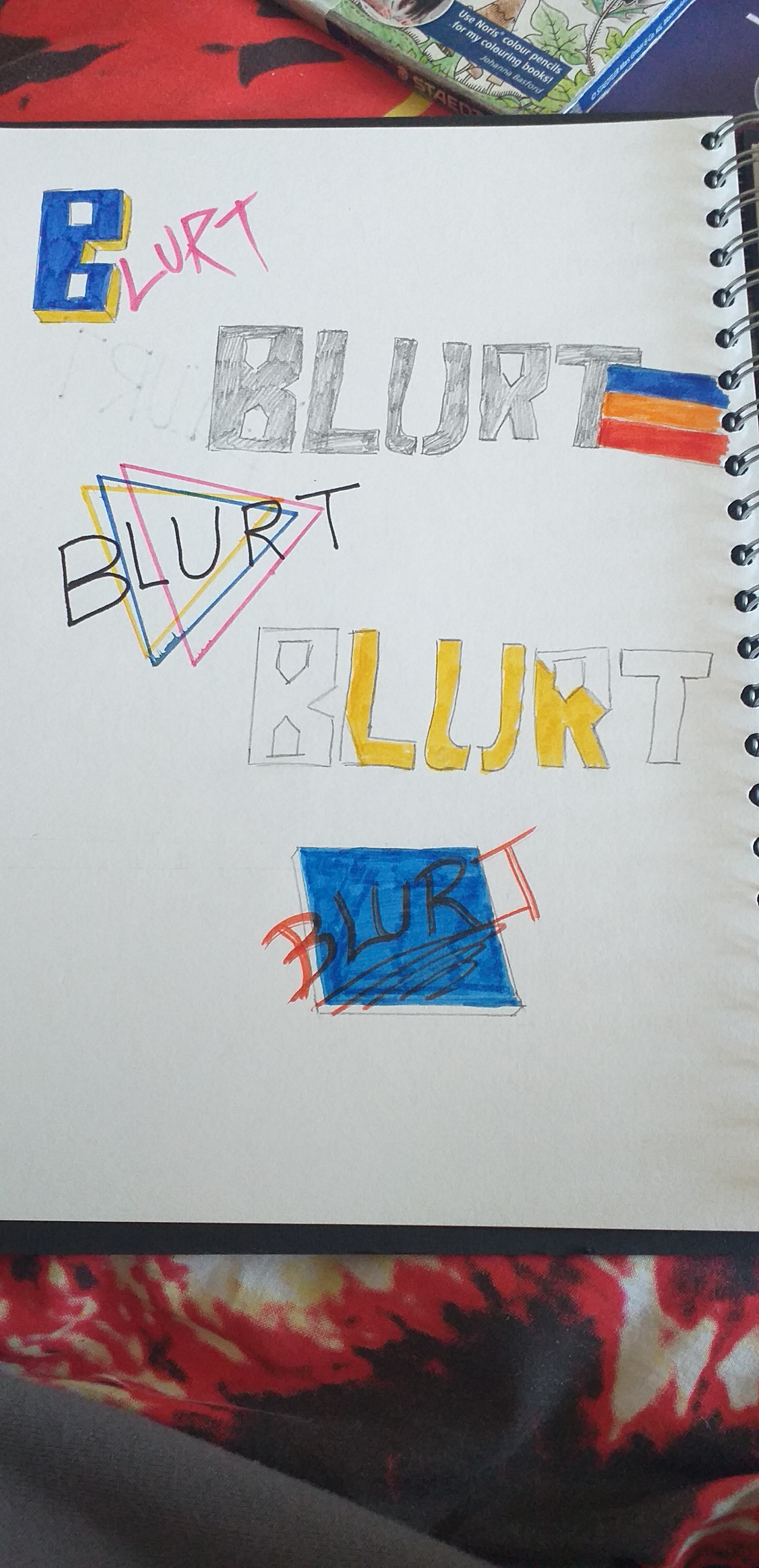
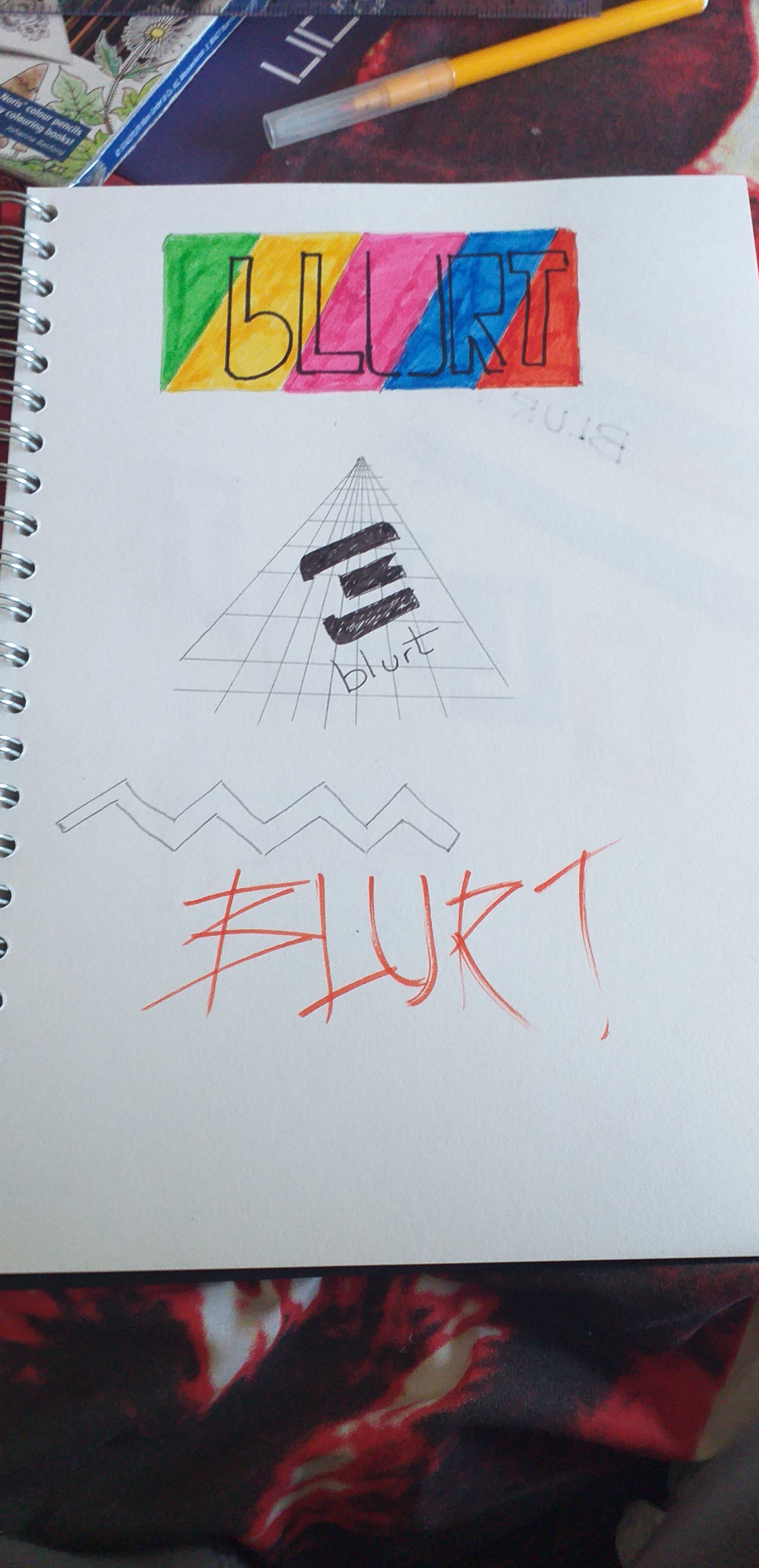
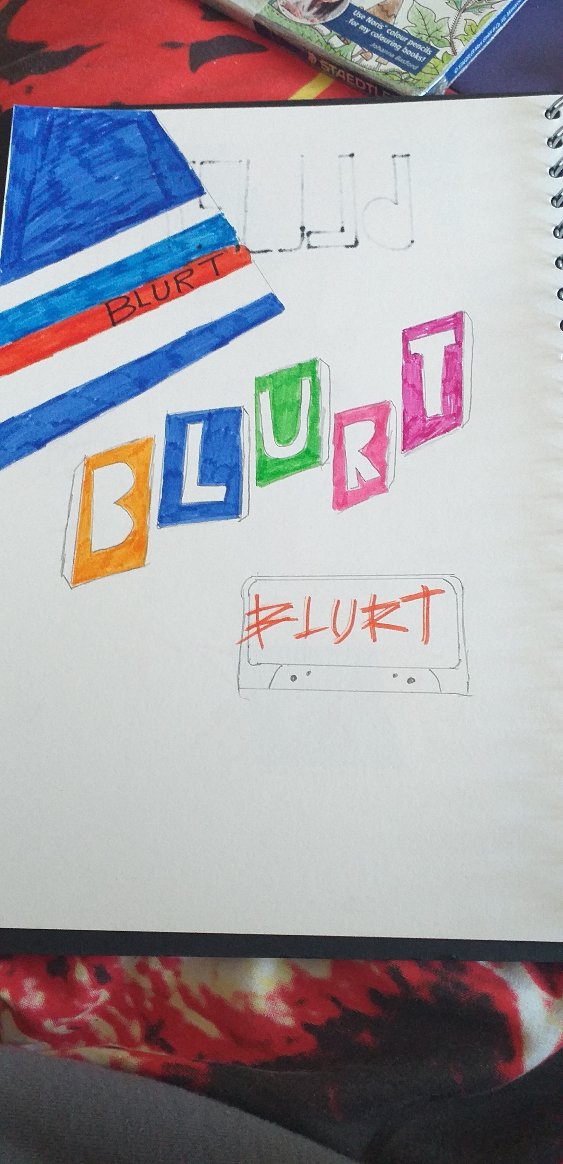
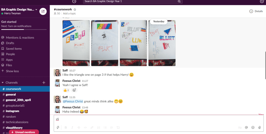
For my first page of experiments I tried out different ways to position text and what it would look like within a design. Throughout my logo development I went for retro approach as it will link with the target audience. I really like the grid logo as it is simple and effective.For these logo developments I thought the grid from the style of perspective drawing was very different from my other designs as most of the designs looked similar in terms of mood and style. it will be interesting how this would look as a logo design. to improve the design is to add some colour to convey its personality and mood.For these designs the cassette is my favourite as it conveys a more retro feel to it. and the style for the font assists the design in terms of mood and fitting with the theme.From this screen shot of feedback I got from my colleagues, they really like the logo on page 3 with the triangles overlapping and blurt written in the middle.