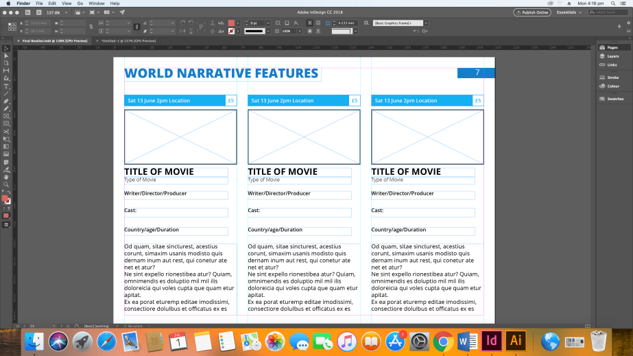
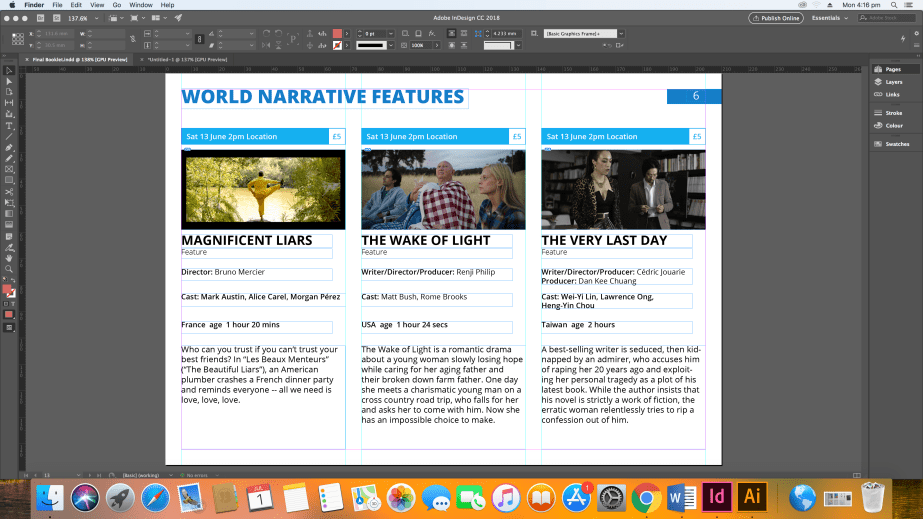
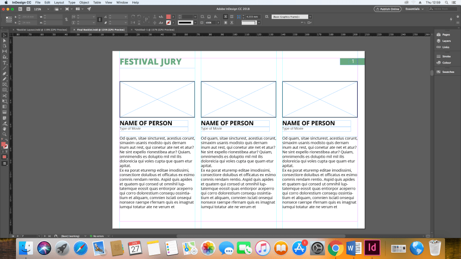
I started to include the films to see how they look when showcased, I’m really happy with the finished layout because it doesn’t look busy, just conveying lots of information in a simple form.
4)
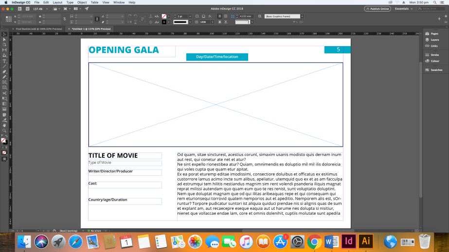
3)
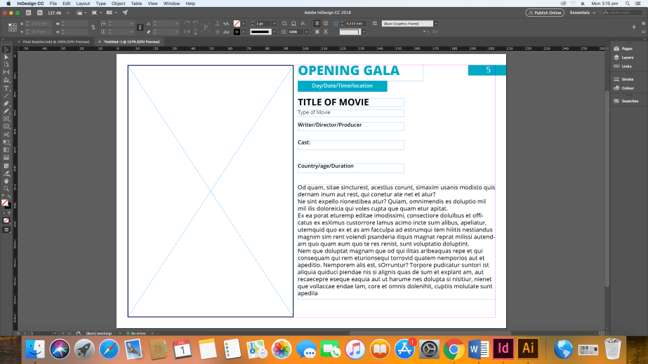
2)
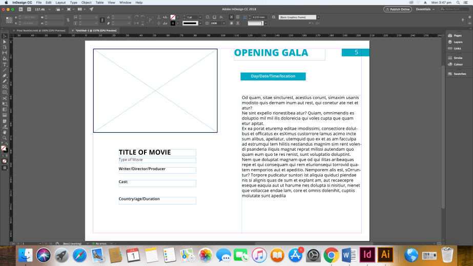
1)
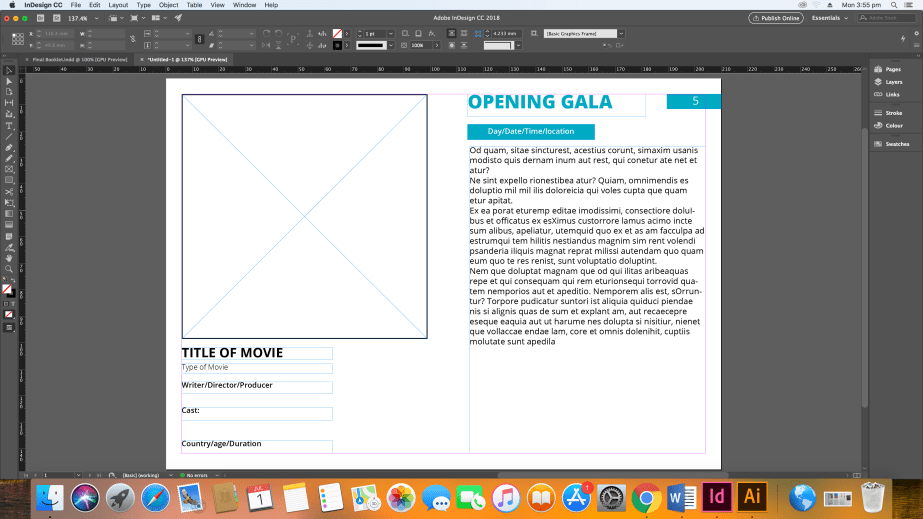
I created for experimental layouts with the opening gala page, I asked my peers to vote which one was more appropriate and most of the class liked the second layout because
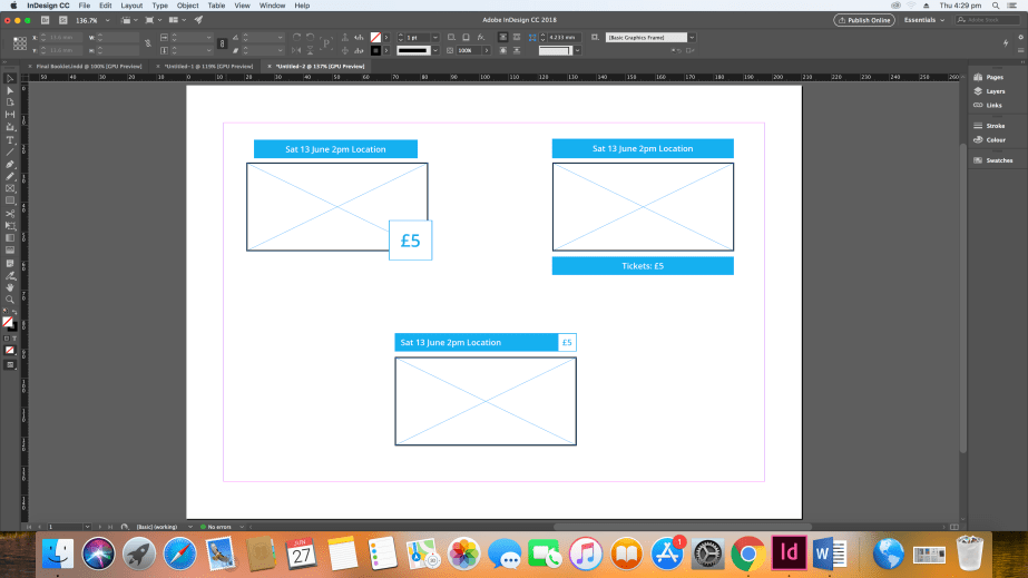
IMAGES, HEADER & PRICE POSITIONING
BOOK TAB

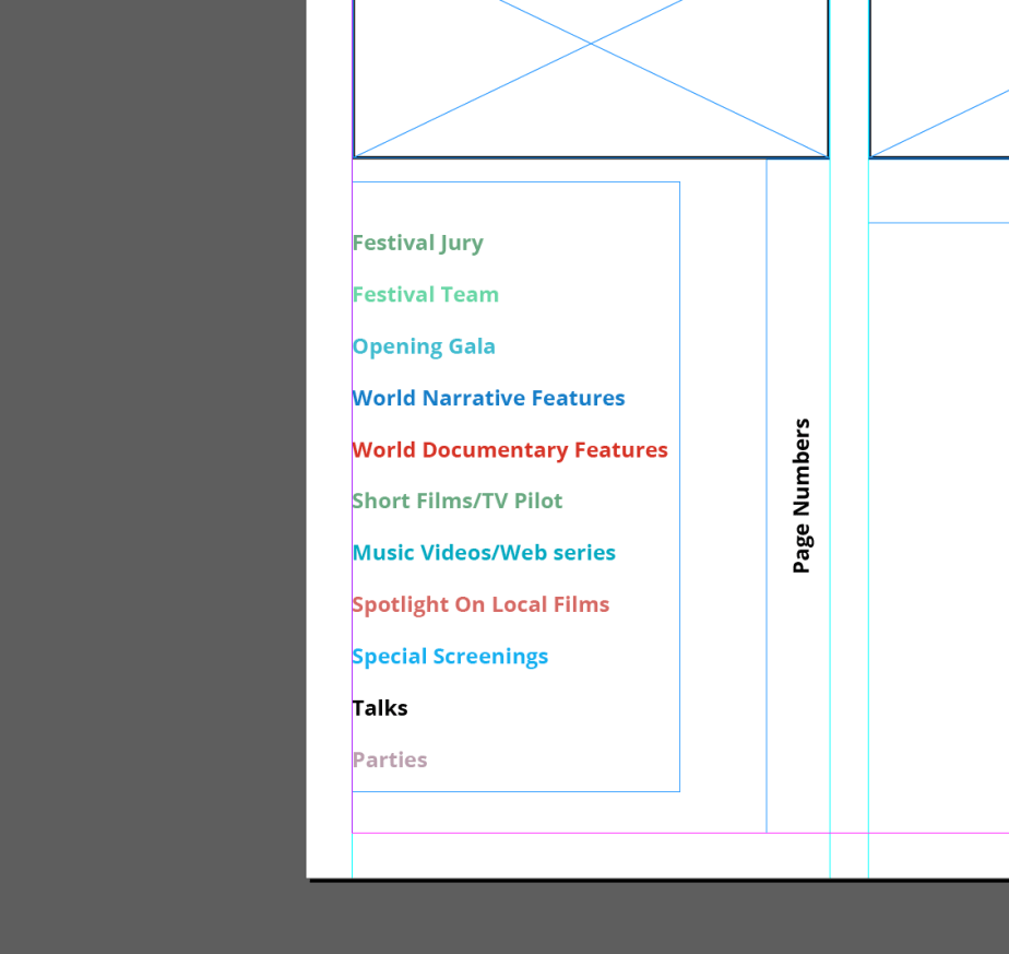
Having the markers as the same colour as the headers would convey a navigation, For example If the reader wanted to read a specific page they search for the colour in the content and find the colour tab that matches it.

During development
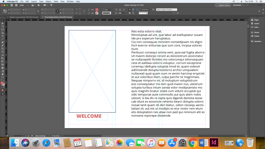
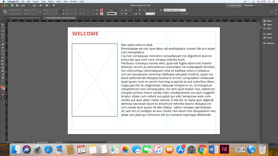
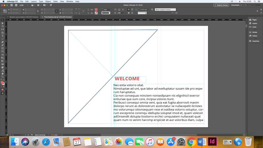
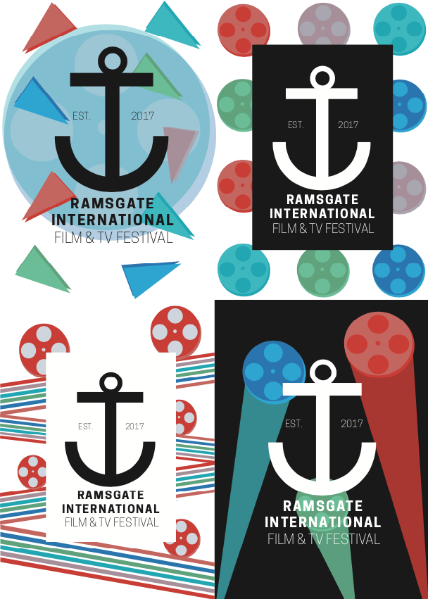
The development of the welcome page wasn’t as difficult as the others as this page had less information on it, I tried three different designs that I preferred out of my sketchbook. even though I like the geometric design aspect it didn’t look appropriate for the mood and tone that I wanted to convey. The Middle image is the design I will use for my final booklet I believe it conveys a simple and fresh design and similar to the last previous programmes and makes sence that the ‘welcome’ header is placed at the top as it feels like an introduction.
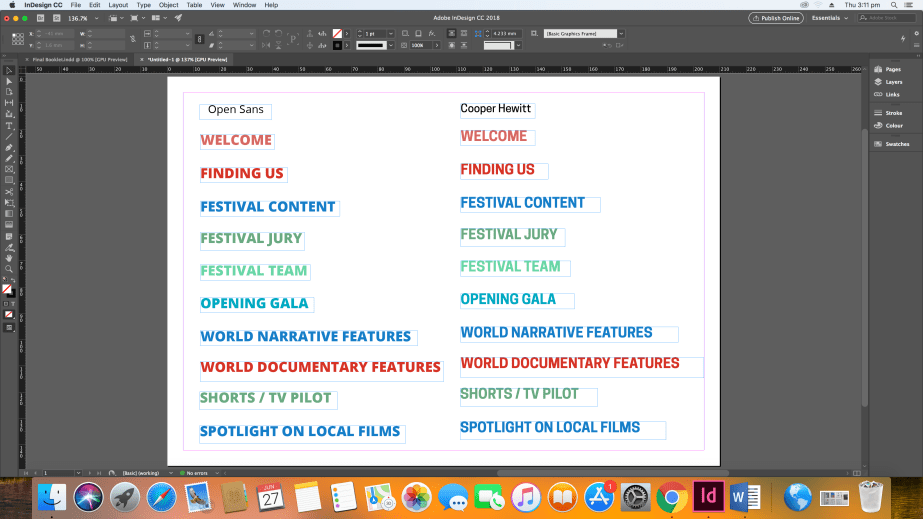
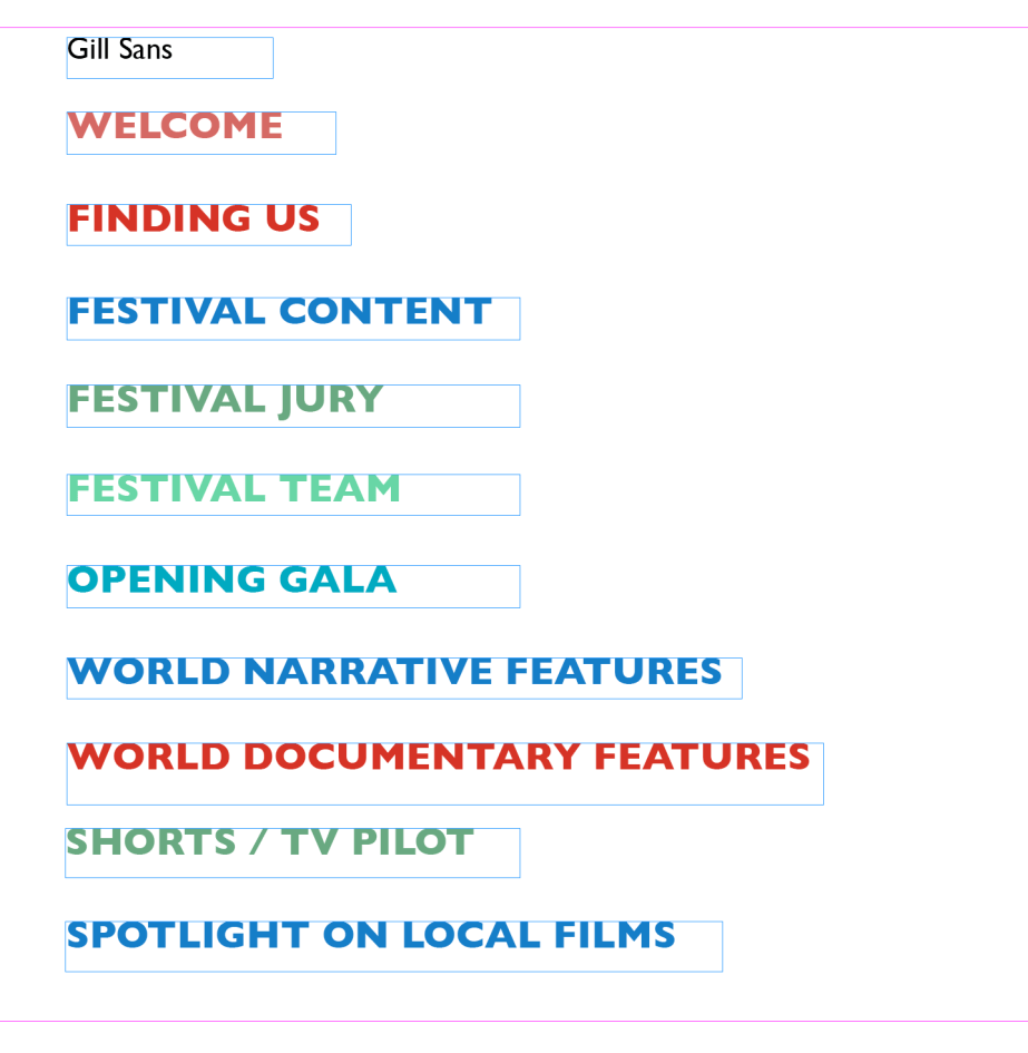
For the Typefaces that I have chosen: Open Sans, Cooper Hewitt and Gill Sans, I have chosen these typefaces as they look more fresh and modern and easy to read which is important when conveying information. Furthermore they all come in lots of different weights which is helpful when conveying hierarchy of text. However the typeface I believe is more appropriate is Open Sans because it feels and looks more friendly than the others, even though Cooper Hewitt was close I felt it was a bit too thin and tall to be a body text.