This exhibition gave me ideas of how to use colour to symbolise a certain mood or tone and how shapes are formed to convey this. The colours used are vibrant which will be important if a focal point was featured in my final idea.
This exhibition gave me ideas of how to use colour to symbolise a certain mood or tone and how shapes are formed to convey this. The colours used are vibrant which will be important if a focal point was featured in my final idea.
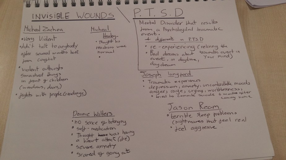
This documentary explores P.T.S.D (Post Traumatic Stress Disorder) the symptoms and difficulties veterans suffer after conflict and returning and adapting to a normal life again.
MY PROJECT, INTENTIONS & TARGET AUDIENCE
My project will be about veterans suffering from P.T.S.D (Post Truamatic Stress Disorder) and raising awareness of the condition. I will make posters which will be impacting and dark in tone to increase it’s message and more engaging. The Target audience will be people who know someone or family member that is suffering from this mental illness.
Bibliography
Carson, N. and Hamilton, R. (2018). 21 perfect font pairings. [online] Creative Bloq. Available at: https://www.creativebloq.com/typography/20-perfect-type-pairings-3132120 [Accessed 2 Nov. 2018].
Color.adobe.com. (2018). Adobe Color CC. [online] Available at: https://color.adobe.com/explore/?q=Depression [Accessed 2 Nov. 2018].
Mental Health Foundation. (2018). Home | Mental Health Foundation. [online] Available at: https://www.mentalhealth.org.uk [Accessed 15 Nov. 2018].
STRANGETOWN FINAL OPENING SEQENCE
The final outcome of my opening sequence ‘Strangetown’ was successful, the theme really suits the pace of the sequence and the timing collaboration between the keyframes and the text fading in and out. This creates a haunting tone and the tension builds as the theme progresses to unveil the title of the series. The outline of the rooftops builds as the sequence progresses working well with the theme and the eclipse moon giving it a more scarier tone.
IMAGE 3
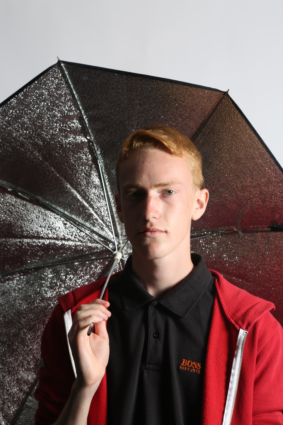
IMAGE 2
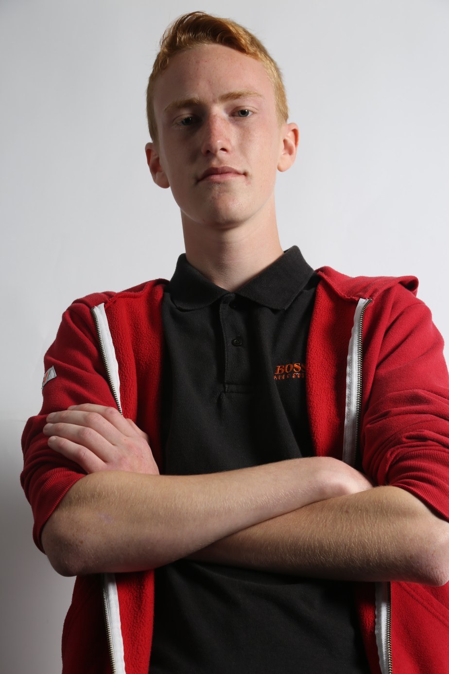
The exposure is really good it makes the red jacket more vibrant and makes the image more eye catching, it’s in focus which is important. The elbow of the right arm has been cut off, cutting off limbs from a model is a big no no unless your taking a body shot avoiding the legs which is common in photography to advertise shirts, jumpers, etc in magazines. To improve this the model have to move more central to avoid any limb cutting.
IMAGE 1
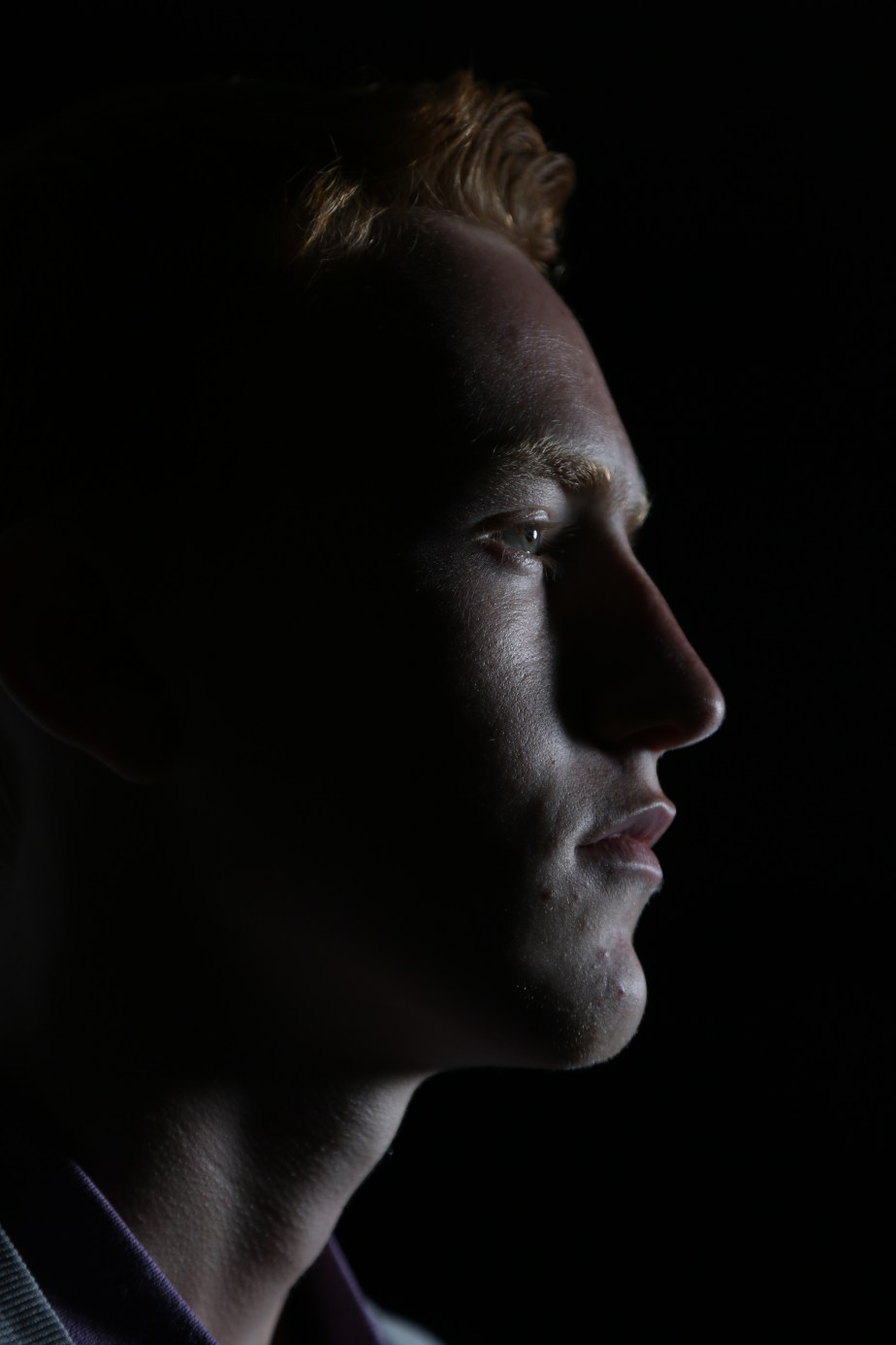
The image has very a good focus which makes the textures from the skin more visible, but the hair line to the actual hair is out of focus as the focusing was only concentrating of the face area then as a whole. to improve this make sure everything is in focus before taking. The nose does not show much of a scale as the shadows mute it, to improve this a reflector would be used to bounce the key light to the shadowed area of the face to display more shape of the model.
The colour tone is very cold which is effective if your using this image to showcase a space or sc-fi theme as it would make sense as space is a cold and dark atmosphere.
If this was to be improved colour wise colour filters would an alternative to give more life to the model and the image in general or edit it in photoshop.
Overall I like the image its probably my best one in a long time considering I haven’t been taught photography consistently and this is a big step forward improving my skills.